Document class novel - documentation.
V. 2.1, 2024/02/17
ALERT: If you have been using this document class prior to version 1.80 (February 2023), see Appendix Z.
The novel document class is for authors of text-intensive original fiction, such as detective novels, murder mysteries, romance, sci-fi, and collections of short stories. Academic works and graphic novels are excluded.
The resulting PDF uses built-in technology to produce PDF/X compliant files for print-on-demand (P.O.D.) services. There is no capability for E-books, and never will be.
To use novel, you need TeXLive 2020 or later, or recent MikTeX. Open your TeX package manager, and install both novel and libertinus-fonts.
1. Before You Begin
 This documentation assumes that you have some familiarity with TeX, but not much expertise.
You usually cannot take an existing document, written with some other class, and just change it to novel. The command set used by novel is very different from that used by others.
Before you wonder why your document doesn't work, you need to understand the differences. All of these are features, not bugs. They are done with the intent of making novel best for its intended purpose. But if you have been in the habit of writing academic papers, the differences may surprise you.
1.1. Do These Things
1.1.1. Use the LuaLaTeX Compiler
A. At the top of your *.tex main document, before the document class, place these lines:
% !TeX TS-program = lualatex
% !TeX encoding = UTF-8
Those instructions are read and understood by many TeX editors, and also serve as a reminder to yourself.
B. If you compile by command line, try this:
lualatex your-document.tex
C. If using a service such as ShareLaTeX online, open the Menu, and scroll down to where you can choose the compiler. Set it to lualatex.
1.1.2. Use UTF-8 Encoding
A. If you use a plain text editor, or TeXWorks, or export plain text from a word processor, be sure that your text is encoded as utf-8, without byte order mark (BOM).
B. Instead of typing TeX codes such as \`{e} you can simply paste è from a Unicode character map. Other alphabets such as Greek and Cyrillic are directly supported, as long as you choose fonts that support those character sets.
C. If you are on Windows, do not use Notepad! The free Notepad++ (also Portable version) is a suitable plain text editor. Configure it as specified, with utf-8 but without BOM. Does not matter whether UNIX or DOS line endings, as long as you are consistent.
1.1.3. Language Support. CHANGED IN VERSION 2.
A. Prior to version 2 (February 2024), the polyglossia package was the only method for language support. With version 2, you may use either polyglossia or babel.
B. Do not write \usepackage or \RequirePackage
for polyglossia or babel. The correct package will be loaded automatically.
C. To use polyglossia, write
\setmainlanguage[options]{language} in preamble.
You may also use other polyglossia commands. Do not use the document class options
to set language. See the polyglossia package documentation.
D. To use babel, write v2 as a document class option, along with your choice
of babel language options. See babel documentation.
E. If you do not choose either method, then the default language will be US English, using polyglossia.
F. Some examples:
• \documentclass{novel} Polyglossia.
\setmainlanguage{french}. french.
• \documentclass[v2,french]{novel}. Babel, french.
• \documentclass[french]{novel}. Uses polyglossia, because no v2
as class option. The request for french is ignored, and triggers
"unknown class option".
1.1.4. Use Open Type Fonts
A. The built-in fontspec package requires utf-8 encoding. It is able to load Open Type fonts, and access their internal feature sets. Forget Type 1 fonts and special encodings! If you wish to use Greek or Cyrillic, all you need are compatible fonts.
B. If you accept the pre-configured fonts (from package libertinus-fonts), then you do not need to know anything about fontspec. But if you wish to configure your own fonts, Appendix E reviews the most important parts of fontspec syntax.
1.1.5. Read About Book Design
A. This documentation has an extensive section regarding book design. Read it.
B. In particular, you will learn how to format pages according to their position and purpose in the book; you will learn how to construct a table of contents; you will learn how you must end your document.
1.2. Avoid These Things
1.2.1. Avoid Non-Fontspec Font Loaders
A. The method for loading fonts is described in section 4.2. Be sure you read it.
B. Do not load fonts via \usepackage or \RequirePackage, or by \setmainfont.
1.2.2. Avoid TeX Font Sizes
A. Standard text size commands, such as \small or \LARGE, will be ignored. The text will appear at its normal size, just as if the commands did not exist.
B. Novel provides its own capability to size text, using different commands.
C. ![]() The novel-specific size commands maintain text line grid, where possible. This is important for printed fiction.
The novel-specific size commands maintain text line grid, where possible. This is important for printed fiction.
1.2.3. Avoid Academic Structures
 A. Commands such as
 \section, \chapter, \abstract, \index, \tableofcontents, \maketitle, and many other structural commands will not work with novel. This is intentional.
B. The float, picture, and table environments are disallowed, unless you are in sandbox mode. This is intentional. In novel there are specific ways to place images or construct a table of contents.
C. Novel has chapter-related commands specifically created for the needs of fictional works.
D. ![]() Novel is focused on doing one thing well, rather than many things poorly. That is why so many "academic" commands have been discarded. They are not necessary in popular fiction.
Novel is focused on doing one thing well, rather than many things poorly. That is why so many "academic" commands have been discarded. They are not necessary in popular fiction.
1.2.4. Avoid TeX Editors and IDEs
A. Many TeX editors assume that you are using a standard TeX document class. They may attempt to insert code that does not work in novel class. Or, they may not understand the commands specific to novel. Do not use those editors.
B. The TeXWorks editor is satisfactory. Be sure that you do not run scripts that change the content of your document.
1.3. Beware of These
1.3.1. Beware of $, %, and Other TeX Special Characters
A. This is standard TeX behavior. Just a reminder!
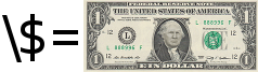 B. TeX has a number of special characters. If you type them in a document, they will not appear as an ordinary printed character, but will do something else. These are:
$ % # _ ^ & ~ \ { } and sometimes [ ]
C. In some cases, an incorrect usage will provide an error message that can be easily deciphered.
D. Incorrect use of the dollar sign may either place your text in math mode (not your intent) or produce a baffling error message that points to an innocent package.
E. The percent symbol normally produces no error, since it is a comment character. But then, whatever text follows on that line will be missing from your PDF. Unless you carefully review the PDF, you might not notice that text is missing.
F. Special characters, other than the backslash, are escaped by placing a backslash in front, thus: \$ for the dollar sign, \% for percent. If you must print a backslash, \string\ does it.
G. ![]() To avoid unforeseen problems, you should review your document in a text editor, prior to compiling. Search for any instances of special characters, particularly dollar and percent. Backslash them as needed.
To avoid unforeseen problems, you should review your document in a text editor, prior to compiling. Search for any instances of special characters, particularly dollar and percent. Backslash them as needed.
1.3.2. Beware of Layout Surprises
A. In novel, inter-line spacing is fixed. There is no padding between paragraphs. No plus/minus "flexible glue." This is standard for printed fiction.
B. When TeX processes a document on a paragraph-by-paragraph basis, it chooses the layout that has the least total "penalty." Penalties are assessed based on factors such as word spacing, hyphenation, widows, and orphans (clubs). Novel applies a moderately strong penalty to hyphens; they are allowed, but discouraged. Widows and orphans are penalized very little. Word spacing, and even the spacing and characters within words, are controlled by moderate settings of the built-in microtype package.
C. ![]() You are likely to find widows and orphans on many pages. If you wish to remove them, you must edit your text. This choice was made for several reasons: First, attention to widows and orphans would reduce the effectiveness of the other, more important, layout penalties. Second, fiction often has numerous short paragraphs (especially with dialogue), and it is very difficult for software to deal with all of them. Third, a great deal of contemporary fiction allows widows and orphans, when they are not distracting.
You are likely to find widows and orphans on many pages. If you wish to remove them, you must edit your text. This choice was made for several reasons: First, attention to widows and orphans would reduce the effectiveness of the other, more important, layout penalties. Second, fiction often has numerous short paragraphs (especially with dialogue), and it is very difficult for software to deal with all of them. Third, a great deal of contemporary fiction allows widows and orphans, when they are not distracting.
2. Document Class Options
A. As with other LaTeX classes, novel is called this way:
\documentclass[options,separated,by,commas]{novel}
B. You do NOT use class options to choose paper size, font size, or any other dimensions. The settings are described in section 4.
C. Default sizes are appropriate for most print-on-demand, softcover fiction.
2.1. draft
A. May NOT be used for final, print-ready PDF.
B. The word DRAFT will appear at the upper left of each page.
C. When text cannot be precisely wrapped, a small black bar (overflow rule) appears at right. These locations are reported in the log file as "overfull hbox" warnings. Example:

D. Some class options are only effective when used with draft option.
E. PDF/X compliance is turned off. This over-rides any PDF/X setting.
F. Some packages take note of whether or not the document is in draft mode, and change their behavior accordingly. However, the included microtype package will always be in final mode, and the included hyperref package will always be in draft mode.
2.2. sandbox
You may work in sandbox mode as a class option:
\documentclass[sandbox]{novel}
A. In sandbox mode, you can use many packages that would otherwise be prohibited. This will allow you to create tables and diagrams using nearly any methods ordinarily available in most other document classes. Of course, you may have to load some additional packages.
Also, when in sandbox mode, many glues and lengths are set to values that are typical of other document classes, rather than the special values ordinarily used by novel.
B. The sandbox is limited to 4 pages of output, regardless of document length. So, you cannot use sandbox for your whole book. Instead, create one or more separate sandbox files.
C. Your sandbox document should have the same layout as your full document. Then it is a drawing canvas. On a per-page basis, whatever fits in sandbox will also fit in your main document.
D. If you also enable draft mode and shademargins, you can see the size of available space on the sandbox pages.
E. When not in draft mode, the sandbox pages will have empty headers and footers (no matter which style you use).
F. Post-process your sandbox PDF using novel-scripts. Then you will obtain black/white or grayscale raster images, with surrounding white space trimmed away. These images can be placed as ordinary images in your main document.
G. ![]() Why
Why sandbox? Certain ordinary TeX commands and environments will disturb the novel page layout. Others will invalidate PDF/X. When you create something in sandbox, then convert it to a raster image, those bad effects are neutralized.
2.3. shademargins
 A. Only effective with draft option.
B. Helps to visualize and detect possible layout problems.
C. Applies dark gray shade to unsafe areas (if set). Applies medium gray shade to margin areas. Applies light gray shade to header/footer areas.
D. Margins include areas inside and outside the unsafe zones.
E. If Media Size exceeds Trim Size, the area outside the Trim Size will not be gray, because it is not part of the finished book.
F. ![]() Technical Info: During page shipout, the gray areas are added as background colors, with a white box above it, then text (and images, if any) on top.
Technical Info: During page shipout, the gray areas are added as background colors, with a white box above it, then text (and images, if any) on top.
2.4. cropmarks (do not use unless required)
 A. May be used with or without draft option.
B. Marks are 0.25pt weight, 0.125in long, beginning 0.125in from the TrimBox, ending 0.25in away from TrimBox.
The illustration shows a document with Trim Size floated in a larger Media Size. The invisible TrimBox is outlined in green. The tiny crop marks sit outside the TrimBox.
C. ![]() Do not load any package that provides other cropmarks. They are incompatible, whether or not you use the
Do not load any package that provides other cropmarks. They are incompatible, whether or not you use the cropmarks option.
D. Most print-on-demand services do NOT want crop marks (also known as trim marks). Do not use this option unless you are certain that you need crop marks!
E. Whether or not you use cropmarks option: In PDF/X, the file contains invisible information (TrimBox) that is understood by automatic print/cut machines.
F. The PDF term CropBox is related to cropview, NOT crop marks.
2.5. cropview
 A. Only effective with draft option.
B. Ignored if Trim Size is same as Media Size.
C. Instructs PDF viewer: Only display Trim Size on screen.
D. Helps to visualize trimmed book size, when Media Size is larger than Trim Size.
E. ![]() Technical Info: Normally, the PDF CropBox is equal to the MediaBox. This option sets the CropBox equal to the TrimBox.
Technical Info: Normally, the PDF CropBox is equal to the MediaBox. This option sets the CropBox equal to the TrimBox.
2.6. closecrop
 A. Only effective with draft option.
B. Minimizes white space surrounding the text/header/footer, so that the result may be viewed on a hand-held device at largest practical text size.
C. Purpose: Helps you to visualize your own book, while traveling, before you make final edits.
D. This is NOT an e-book. It does not meet e-book standards, and cannot be changed to meet e-book standards.
E. ![]() Technical Info: First, the live area (text plus head/foot) is calculated from the original settings. Then, small margins are added, and the Trim Size is reduced to fit. So, the closecrop PDF size is not the same as in the print-ready PDF, although the page layout is the same.
Technical Info: First, the live area (text plus head/foot) is calculated from the original settings. Then, small margins are added, and the Trim Size is reduced to fit. So, the closecrop PDF size is not the same as in the print-ready PDF, although the page layout is the same.
2.7. xml
A. Only effective with PDF/X. Only effective when NOT in draft mode.
B. Copies internal XMP Metadata to a separate jobname-XMPasXML.xml file.
C. Not necessary. Only informative. Does not affect structure or content of PDF.
D. ![]() Technical Info: XMP packet may be isolated by editing the *.xml file, in a plain text editor (requires utf-8). Necessary edits are obvious.
Technical Info: XMP packet may be isolated by editing the *.xml file, in a plain text editor (requires utf-8). Necessary edits are obvious.
2.8. coverart (deprecated)
This option is only used for cover artwork. However, in the intervening time since novel was first introduced, the printing technology has evolved. Now (late 2023) using novel technology is not the best way to produce your book cover file, although it still works. See section 7.1.2.
2.9. Developer Options
These options are primarily used for developer testing, not user production. Using them may cause compilation to fail, or produce an undesirable result. That is not considered a bug.
A. mtoff The microtype package will not be loaded.
B. test Only used with file novel-testsuite.tex.
C. unblock Allows use of some packages that would otherwise be blocked.
2.10. revert
Version 1.80 has some minor tweaks, so that documents compile faster.
In most cases, a document compiled with earlier version 1.52 will look the same.
If it does not, the class option revert will undo the tweaks.
3. Metadata, File Data, and PDF/X
A. The commands described on this page are used only in the Preamble.
B. These commands write non-printing information to the PDF file. Some of the information is used to identify and classify the file. Other information is read by the printer, to assist it with printing choices.
C. ![]() Some of the terms have different meanings, depending on whether they are used in the context of printing, book distribution, or ebooks. To avoid confusion within this documentation I will use different terms when they mean different things. When you are communicating with your printing and distribution service, take care to ensure that your understanding of terminology is what they really mean.
Some of the terms have different meanings, depending on whether they are used in the context of printing, book distribution, or ebooks. To avoid confusion within this documentation I will use different terms when they mean different things. When you are communicating with your printing and distribution service, take care to ensure that your understanding of terminology is what they really mean.
3.1. Definition of Terms
This section is more detailed than it needs to be, because my review of various online forums (unrelated to TeX) shows a lot of user confusion.
3.1.1. ISBN Metadata
A. When you obtain the ISBN for your book, either directly through the issuing agency or via your chosen print service, you will enter ISBN Metadata in an online form.
 B. This metadata goes into a database, and identifies your printed book in distribution and sales channels. It neither knows nor cares about PDF. (If you were marketing a PDF ebook, instead of print, that would be a different story.)
C. ISBN Metadata includes title, author(s), subtitle if any, ISBN, and other identifying information. Once the book is released, this information (normally) cannot be changed.
D. You may also enter a description, genre classification, and other information that will help people find your book by browsing, and help to sell your book. This information can usually be changed at a later date.
E. ![]() The ISBN refers to your printed book, not to the PDF file. You are not selling copies of the PDF.
The ISBN refers to your printed book, not to the PDF file. You are not selling copies of the PDF.
3.1.2. Printed Metadata
A. Printed Metadata refers to the information that can be seen on paper, in expected places: the book cover, the title page, and the copyright page.
 B. Whether your book was printed from a PDF file, or by some other method, is not relevant.
C. Your print service will insist that the title, subtitle (if any), author, and ISBN in these places exactly match what appears in the ISBN database. Of course, you can (and usually will) use styling or images to make the Printed Metadata more attractive than the plain-text ISBN Metadata.
D. Some print services may object to artwork that is too fancy, on the grounds that it is difficult to discern the title and author. Although this is very unlikely, it is better to ask before committing resources.
3.1.3. File Data (PDF Metadata)
A. Your PDF has internal metadata, which can been seen by PDF reader software.
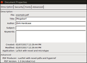 B. To avoid confusion, this documentation uses the term File Data to mean this internal PDF Metadata.
C. You can see some of the File Data when you open the PDF in any reader, and go to File>Properties. To see all of it, you need professional software (such as Adobe Acrobat Pro).
D. ![]() Be sure to read the rules for File Data, below. Some of it is generic, and some is particular to TeX or to the novel class.
Be sure to read the rules for File Data, below. Some of it is generic, and some is particular to TeX or to the novel class.
3.2. Rules for File Data
File Data must conform to several specifications, in terms of what you may or may not write. Some of the limitations are imposed by the book distribution industry, which stores information in its databases a certain way.
What File Data do you need, if any? Ask your print service.
3.2.1. Required, Prohibited, Optional?
A. If PDF/X compliance is required, then you must at least set the title in File Data, using the \SetTitle command. Note that this title is not styled in any way.
B. Some print services require a minimum amount of file data, particularly title and author, which must match the printed metadata and ISBN metadata for these fields.
C. Other services may require that the book's ISBN number, with something like _text added, be used in place of the title. Remember that underscore is a special character in LaTeX, so it must be preceded by a backslash.
D. Many print services do not care about File Data, one way or the other. Your PDF is passed through production according to its file name, not its internals. In such a case, assume that title and author are required.
E. ![]() Be sure that any included images are stripped of their own image metadata, such as EXIF. The procedure is described in novel-scripts.
Be sure that any included images are stripped of their own image metadata, such as EXIF. The procedure is described in novel-scripts.
3.2.2. Limited to Latin-1?
A. At least in the USA, your print service may require that File Data be limited to characters in the Latin-1 set. This is because their production and distribution software uses Latin-1 for the database.
B. Latin-1 does not include curly quotes or em dash. You will still be using utf-8 encoding in your document files, but your choice of characters is restricted.
C. Novel allows the title, and other File Data, to be in alphabets such as Greek or Cyrillic. If you are limited to Latin-1, the limitation has nothing to do with TeX or PDF.
D. If your book has File Data using quotes, then use the special commands \straightquote{} and \straightdblquote{}. Be sure to use the braces, so that you don't have to worry about gobbled space. When you use these commands, you eliminate the risk that your software will automatically convert them to the forbidden curly quotes. Example:
\SetTitle{That\straightquote{}s Amore} % That's Amore
E. If you are limited to Latin-1 in File Data, you can still use curly quotes and em dash on the cover and title page, and in headings.
F. ![]() There is no
There is no \maketitle command in novel. You may (and should) apply styling to the printed title, even though the File Data title cannot be styled.
3.2.3. TeX escapes
A. In File Data, you must obey the same TeX rules that apply everywhere: Certain characters have special meaning, and must be preceded by a backslash, if you wish to use them as ordinary characters.
B. The list of special characters:
# $ % & _ (hash, dollar, percent, ampersand, underscore)
Example: The title Doing 9% & Gone is coded:
\SetTitle{Doing 9\% \& Gone}
C. The above characters are rarely needed in File Data. Sometimes they must be spelled out, in order to agree with your book's ISBN Metadata. For example, you may need to write "and" rather than the ampersand, "dollar" rather than the dollar symbol, and "percent" or "per-cent" rather than the percent symbol.
D. Fun fact: The Seven-Per-Cent Solution and The 7% Solution are different books, in entirely different gnres.
3.2.4. Forbidden Characters
A. Do not use the backslash \ except as described above.
B. Do not use the tilde ~ or the circumflex ^.
C. Do not use TeX code, such as \`e for e with grave; instead paste è directly from a character map.
D. Do not use styling, such as {\small text} or \textit{text}.
E. If necessary, use \straightquote{} and \straightdblquote{}. Do not use TeX code for apostrophe or quote.
F. Do not use multiple hyphens to create longer dashes. Do not use em dash or en dash.
3.3. File Data Commands
Now that you understand what File Data means, and how it may be written, you can use commands to write it.
3.3.1. \SetTitle{text}
A. The novel document class does not have \maketitle. The title is not automatically transferred to a title page, because there is no automatic title page.
B. The title can be retrieved as \theTitle anywhere in your document.
C. In certain page layouts, the title is used as default text in recto page headings. You may over-ride this behavior.
D. ![]() You may set the title as empty (or blank space). In very rare cases, that is useful. However, if you do that, then you must follow
You may set the title as empty (or blank space). In very rare cases, that is useful. However, if you do that, then you must follow \SetTitle{} with \SetPDFX{off}, or an error will result. This is because PDF/X standards require a real title.
3.3.2. \SetAuthor{text}
A. The default author is empty (no author).
B. In certain page layouts, the author is used as default text in verso page headings. You may over-ride this behavior.
C. The author can be retrieved as \theAuthor anywhere in your document.
D. If in doubt, use the name as it is spoken. Correct: Mary Smith. Incorrect: Smith, Mary. Possibly correct, if true: Mary Smith, Ph. D.
E. Your PDF file is not seen by a public database. Instead, the public database contains the information you entered, when you obtained the ISBN. So, if you have multiple authors or minor contributors, that is the place to provide search information.
F. Ask your print service about how to enter multiple authors, and how to display them in print. Do not assume that authorship rules pertaining to academic papers will also apply to your novel.
G. ![]() Print-On-Demand services do not like to split royalty payments among multiple authors. Instead, the entire account is the responsibility of one main author or editor.
Print-On-Demand services do not like to split royalty payments among multiple authors. Instead, the entire account is the responsibility of one main author or editor.
If anyone else is involved, that is a matter of private contract betwen the one main author/editor, and any other contributors. The print service neither knows nor cares about such agreements, and will do nothing to cooperate.
[DISCLAIMER] Here is my amateur advice: Consider using other contributors on a work-for-hire basis. This involves a written contract, prior payment of a fixed amount that does not depend on sales, and no grant of rights. You also need written assurance that the hired persons have the right to sell you the work they provide. If you need professional advice, then consult a professional.
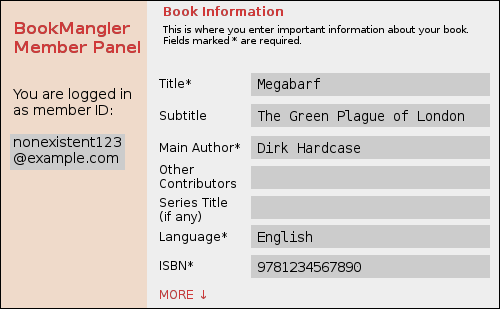
3.3.3. \SetSubtitle{text}
A. The subtitle can be retrieved as \theSubtitle anywhere in your document.
B. The subtitle does not appear in File Data, and does not appear anywhere in your book, unless you manually write it there (either manually, or via \theSubtitle.
C. If you want the subtitle to appear in File Data, manually include it via \SetTitle. Example:
\SetTitle{Megabarf: The Green Plague of London}
Then, you may need to adjust page headings so that only the main title appears.
D. ![]() Usually, there is no benefit to including the subtitle in File Data. The search database does not read your PDF. It reads the information you entered as ISBN Metadata, which does have an entry for subtitle.
Usually, there is no benefit to including the subtitle in File Data. The search database does not read your PDF. It reads the information you entered as ISBN Metadata, which does have an entry for subtitle.
3.3.4 Advanced: \SetApplication{text} and \SetProducer{text}
A. The Application, also known as CreatorTool, is the program used to create your source document. Text editors, word processors, and page layout programs are the most common Applications (not specific to TeX).
B. The PDF Producer is the program that converts the source document to PDF. In many cases, the Producer is a back-end, directly linked to the Application.
C. These details are automatically created when you compile your document, without any input from you. However, if you have the need to provide a custom text string for the Application or Producer, these commands will do it.
3.4. PDF/X
A. Commercial printers are very likely to require PDF/X compliance. This ensures that your PDF meets a variety of criteria, by containing those things it must contain, and omitting those things it must not contain.
B. Most perfectly valid PDF files are not PDF/X compliant, simply because they are not intended for commercial printing.
C. To set PDF/X compliance, use this command in Preamble:
\SetPDFX[OutputIntent]{ComplianceStandard} and starred version
D. ![]() A non-PDF/X file is not a defective file! It complies with PDF standards, but not PDF/X standards. Some print services insist on PDF/X. Others don't care, as long as the fonts are embedded (which they always are).
A non-PDF/X file is not a defective file! It complies with PDF standards, but not PDF/X standards. Some print services insist on PDF/X. Others don't care, as long as the fonts are embedded (which they always are).
E. ![]() Some document class options are not used for final print production. When you use these options, PDF/X will be temporarily turned off, regardless of your setting.
Some document class options are not used for final print production. When you use these options, PDF/X will be temporarily turned off, regardless of your setting.
3.4.1. Compliance Standards
A. The following choices are available:
X-1a:2001 (default)
X-1a:2003
X-3:2002
X-3:2003
off
B. The first of these is the one that is most widely accepted in commercial printing. Anything meeting X-1a:2001 necessarily meets the other standards.
C. If your book involved complicated color artwork, then the correct choice might be crucial. But for a black and white book block, X-1a:2001 is the preferred choice, unless your print service says otherwise.
3.4.2. Output Intent
A. Output Intent informs the printer that you "intend" your PDF to be printed according to certain technical capabilities, particularly regarding color.
B. If your are using color-managed workflow with a calibrated monitor and color profile, and if the actual printer matches your intent, then you can expect accurate printed colors within the technical limits.
C. If the intended printer does not match the actual printer, there are three possible results: (1) The file will still be printed, but colors may be inaccurate. Home and office printers do this routinely. (2) If the printer is very advanced, it will adjust its properties to emulate the intended printer. (3) The printer may reject the print job, because it knows that it cannot produce the intended results.
D. The above considerations are very important for glossy fashion magazines, somewhat important for color book covers, and unimportant for non-color book text. Nevertheless, an Output Intent is required to meet PDF/X compliance, even when it does not matter.
E. The Output Intent is an optional argument to \SetPDFX, because a default will be used when the Intent is not specified.
3.4.3. Built-in Output Intent Codes
A. There are three pre-defined choices for Output Intent:
CGATS TR 001 (default) (can also use CGATSTR001)
FOGRA39
JC200103
B. The first of these is known as "US Web Coated SWOP v2" in the USA, and is the most commonly-used American print standard for this kind of book.
C. The second is widely used in Europe, the third in Japan.
3.4.4. Other Output Intents
A. If you are required to use an Output Intent that is not one of the above three, then you have to code it yourself.
B. In a place where TeX can find it, create a plain text file with its file name in the following format:
File name begins with novel- (note the hyphen).
No spaces or underscores in file name, no matter what the Intent.
File extension is .clo
C. Example valid file name: novel-YourIntent.clo.
The above file is loaded using \SetPDFX[YourIntent]{compliance}.
D. The file contains (up to) five \gdef commands. The \@OIidentifier is called "reference name" by some authorities. Here is the code used for CGATS TR 001:
\gdef\@OIidentifier{CGATS TR 001}
\gdef\@OIcondition{SWOP (Publication) printing in USA (Printing process definition: ANSI CGATS.6).}
\gdef\@OIinfo{U.S. Web Coated (SWOP) v2}
\gdef\@OIregistry{http://www.color.org}
\gdef\@OIprofile{USWebCoatedSWOP.icc}
E. If the data contains any TeX special characters, such as underscore, percent, ampersand, or number sign, they must be escaped using a backslash.
F. The necessary data may be provided by your print service, or perhaps can be found at resources such as the International Color Consortium. Alas, this source (and others) do not make it easy to discern the data.
G. Another place to look for Output Intent data is in your (texmf)/tex/latex/pdfx folder. This will be in your TeX system if package pdfx is installed (but do not load this package into novel class). Files AdobeColorProfiles.tex and AdobeExternalProfiles.tex contain code prepared by the author of the pdfx package. The macro names are not the same, but they are easy to decode: \@OIidentifer is /OutputConditionIdentifier; \@OIcondition is /ProfileName; \@OIinfo is /OutputCondition; \@OIregistry is /RegistryName; and \@OIprofile follows \setCMYKcolorprofile.
3.4.5. Whether or Not to Embed *.icc
A. Each Output Intent has a color profile, in the form of a file with extension *.icc.
B. You usually do not need the color profile, because the printer knows which profile corresponds with which standard Output Intent code.
C. When you use \SetPDFX in its un-starred form, the *.icc color profile will not be embedded in the PDF. This is the normal situation.
D. If your print service demands that you embed the *.icc color profile, then use \SetPDFX* (with the asterisk). You must have the actual *.icc file available where TeX can find it.
E. ![]() Do not embed the *.icc color profile unless specifically requested by your print service. If you embed it when you should not, the result may be worse!
Do not embed the *.icc color profile unless specifically requested by your print service. If you embed it when you should not, the result may be worse!
F. ![]() If your printer requests "US Web Coated SWOP v2" and, as usual, requests that you not embed the corresponding *.icc color profile, then some software will read the Output Intent as "CGATS TR 001" instead of "US Web Coated SWOP v2". They are identical.
If your printer requests "US Web Coated SWOP v2" and, as usual, requests that you not embed the corresponding *.icc color profile, then some software will read the Output Intent as "CGATS TR 001" instead of "US Web Coated SWOP v2". They are identical.
3.4.6. Where to Find *.icc Files
A. You do not need an *.icc color profile unless you choose to embed it.
B. Although many *.icc color profiles are freely available, they usually cannot be distributed within an open-source project. You might already have them in your system, wherever such files are stored. Note that TeX uses forward slash in file paths, not backslash, even if the platform is Windows:
Windows: C:/Windows/System32/spool/drivers/color/
Linux: /usr/share/color or hidden ~/.local/share/icc/ or other places
OSX: /Library/Colorsync/Profiles/ or hidden (username)/Library/Colorsync/Profiles/
C. If you do not have a file you need, look on the Internet here and here. These links also have many other profiles, beyond the basic three.
D. In a few cases, your print service may provide the necessary *.icc file.
E. You want printer profiles, usually CMYK. Don't worry about the files being "for Windows," as they are actually cross-platform.
F. If your system has the necessary *.icc file for your Output Intent, but novel cannot find it, then copy the file to the same folder as your TeX document.
G. ![]() Again: Do not embed the color profile unless the printer requests embedding.
Again: Do not embed the color profile unless the printer requests embedding.
4. Book Size, Page Layout, and Fonts
In novel, you do not use class options to set the size or layout of your book, or font size.
4.1. Book Dimensions
4.1.1. Trim Size and TrimBox
Trim Size is globally set in Preamble:
\SetTrimSize{width}{height}
The width and height must have dimensions, such as in or cm.
 A. Trim Size is the finished size of your book, width and height (but not thickness). In the case of softcover books, it is the exact size.
In the case of hardcover books, where the cover is slightly larger than the pages, your print service will tell you whether they mean the cover size or the page size.
B. PDF/X internally specifies the Trim Size as a rectangular TrimBox. This provides invisible instructions to an automated cutting machine, when the Trim Size is smaller than the actual paper sheet. You do not set the TrimBox yourself.
C. Your print service has a list of standard trim sizes. For fiction, you probably want "creme" (off-white) paper, which eliminates a few of the choices. Choice of size may also be limited by the distribution channels.
D. If you do not specify the Trim Size, the default is 5.5in wide, 8.5in high. This is a widely-used "trade" size for softcover print-on-demand fiction in the U.S.A. If in doubt, leave the default.
E. ![]() Do not request a mass-market paperback Trim Size unless you really, truly, know what you are doing. Since you are not a major writer for a major publishing house, you don't know; so, don't do it.
Do not request a mass-market paperback Trim Size unless you really, truly, know what you are doing. Since you are not a major writer for a major publishing house, you don't know; so, don't do it.
4.1.2. Media Size, MediaBox, Bleed, and BleedBox
PDF page size is known as Media Size, defined by an invisible MediaBox in PDF internal code. It is known as paperwidth and paperheight in TeX terminology.
A. For cover artwork, the PDF page size must be larger than the artwork Trim Size, so that the image can bleed outside the TrimBox. Use this command in Preamble:
\SetMediaSize{width}{height}
This will center the Trim Size in the larger Media Size.
B. Generally, the American standard is 0.125in bleed on all four sides of the cover image; metric nations may use 3mm. Then, the Media Size would be 0.25in (or 6mm) larger than Trim Size in both dimensions.
C. Example: Suppose that the Trim Size of your book is 5.5in wide x 8.5in high. Based on the number of pages, its spine width is 0.6in.
Then, the Trim Width of the (Perfect Print) cover will be 5.5in + 0.6in + 5.5in = 11.6in. The Trim Height is 8.5in.
If you are required to provide 0.125in bleed on all four sides, the Media Width is 0.125in + 11.6in + 0.125in = 11.85in. The Media Height is 0.125in + 8.5in + 0.125in = 8.75in. The commands:
\SetTrimSize{11.6in}{8.5in}
\SetMediaSize{11.85in}{8.75in}
D. ![]() If you fail to use
If you fail to use \SetMediaSize with coverart, or choose surprising values, then you will get an error or warning from novel.
E. For the interior book block, almost all P.O.D. services require that the PDF page size be identical to the Trim Size. This is done automatically. You do not use \SetMediaSize.
F. In rare cases, a P.O.D. service will ask you to float the interior book block in a larger, standard paper size. You may use \SetMediaSize for this purpose. The novel class does not support interior bleed, so when you are not using coverart mode, no BleedBox is set.
4.2. Fonts and Normal Font Size
4.2.1. Parent (Main) Font and Size
A. In novel you do not directly set the main font (also known as roman default). Instead, you set a parent font, from which the main font is derived.
B. The default parent font is Libertinus Serif, which is an updated branch of Linux Libertine O. You must install it as package libertinus.
Online services, such as ShareLaTeX, have libertinus.
If you do not have the Libertinus fonts, then Latin Modern Roman will be used as fallback. But LMR is not really suitable for use in printed fiction; it is allowed so that test documents can compile, until you choose a more suitable font.
C. Choose only Open Type or TrueType fonts, not the ancient Type 1 (PostScript) or Metafonts. The font you choose does not have to be part of any TeX package, because you do not need any *.sty file or TeX metrics. All of that is built into the font itself. This is thanks to LuaLaTeX and the built-in fontspec package.
D. ![]() You do not write
You do not write \usepackage{fontname}, or \RequirePackage{fontname}, or \setmainfont{fontname}. If you do that, then a warning or error will result, and in any case the font you get won't be the one you were expecting.
4.2.1.1. \SetParentFont[features]{fontname}
A. In novel you set a parent font, which is the ancestor of several pre-defined font styles, including the main font. In Preamble:
\SetParentFont[features]{fontname}
B. The command uses fontspec syntax, which is reviewed in Appendix E, and described in full detail by the fontspec package documentation.
C. Whether you use \SetParentFont or accept the default, the features and fontname are stored as strings in macros \parentfontfeatures and \parentfontname. You may use \parentfontfeatures and \parentfontname as arguments to other font commands.
D. If you have the proper license, you can use a commercial font. For example:
\SetParentFont{Adobe Garamond Pro}
See how easy that is? By default, novel will apply TeX Ligatures and Kerning to the parent font and all its descendants. Common Ligatures and OldStyle numbers will be added for the main font. This is ideal for fiction.
4.2.1.2. \SetFontSize{length}
A. In the novel document class, you do not set point size as a class option. Instead you use \SetFontSize in the Preamble. It applies to the parent (main) font, and is used as the basis for scaling font sizes.
B. The size may be any units TeX understands, including decimal values. So, 12.8bp and 13.1pt are acceptable. This is because you will be using scalable, Open Type and TrueType fonts throughout your document. They do not need TeX metrics.
C. If you insist on using ancient TeX fonts, then you may need to specify a convenient integer font size such as 11pt or 12pt. But why? Forget those fonts! Welcome to the Twenty-First Century.
D. The minimum global font size is 8pt, and the maximum is 18bp. On a local basis, text may be larger or smaller than this.
E. If you do not use \SetFontSize, the default will be 11.4pt more or less. That is, the size is calculated from other layout settings. When there is less available text area, the default size is 11pt. For larger books, the default is 12pt.
F. Once you have set the Trim Size, margins, and parent font, set the font size for readability. Depending on whom you ask, each line of free-running text should average 60 to 66 characters (including spaces). If you use all of the novel default settings, including Libertinus Serif parent font, that's what you will get. But if you change anything, then do a test document to see what font size works best.
4.2.2. Descendant Fonts: main font, chapter font, subch font, head font
A. The descendant fonts are automatically set, as variations of the parent font:

For example, the main font uses the parent font family. It has TeX Ligatures and Kerning (inherited from the parent font), and also Common Ligatures and OldStyle numbers.
B. The main font is not configured directly. Instead, configure the parent font, then the main font (and other descendants) will obey. For example, if you don't want OldStyle numbers:
\SetParentFont[Numbers=Lining]{fontname}
Then, Lining numbers will be used for the main font (and other descendants).
C. If you don't like the defaults, you can set the other descendant fonts directly, in Preamble:
\SetChapterFont[features]{fontname} % see section 5.1.3.1
\SetSubchFont[features]{fontname} % see section 5.1.3.1
\SetHeadFont[features]{fontname} % see section 4.3.4.2
D. You may use \parentfontfeatures and/or \parentfontname as arguments, if you wish.
4.2.3. Advanced: The Deco Font
A. Open Type font NovelDeco.otf is packaged with the novel class. It is a special-purpose font that provides characters for the \decoglyph and \midcase commands.
B. Normally, you do not need to configure this font, as it is automatic. The only reason for changng it is if you are an advanced user, who wishes to use a substitute font with different decorations. However, you may not specify just any font! The substitute must be an edited version of NovelDeco.otf, with a different font name. If you don't know what that means, then don't do it.
\SetDecoFont[features]{fontname} % see section 5.1.3.3
4.2.4. Advanced: Mono, Sans, and Math Fonts
A. There are several pre-defined fonts that do not descend from the parent font. In each case, an appropriate default font is selected. You will probably never need to use them; but TeX being what it is, default fonts are chosen "whether you like it or not."
B. The default sans-serif font will be Libertinus Sans if available. If not, the fallback font is Latin Modern Sans. To choose your own, use this command in Preamble, with fontspec syntax:
\SetSansFont[features]{fontname}
C. The default monospaced font will be Libertinus Mono if available. If not, the fallback font is Latin Modern Mono. To choose your own, use this command in Preamble, with fontspec syntax:
\SetMonoFont[features]{fontname}
D. ![]() If you need a math font, then may I gently suggest that maybe novel is not the right document class for you?
If you need a math font, then may I gently suggest that maybe novel is not the right document class for you?
Nevertheless, Libertinus Math is loaded if available; otherwise Latin Modern Math.
If neither of those fonts are found, then NovelDeco.otf will be loaded as a fake math font, with no actual math symbols. That allows you to proceed without a real math font. But if you attempt to print math, it will look wrong.
You may choose your own math font using \setmathfont from package unicode-math. See that package documentation for details.
4.2.5. Advanced: Defining New Font Commands
A. You can define new font commands in Preamble. The syntax depends on whether the new font is part of a family (where you might have bold and italic variants), or just a single file (no variants). If part of a family, use \NewFontFamily. If alone, use \NewFontFace.
The \NewFontFamily command (or \NewFontFace) takes three arguments: First, the name you assign to the new font command is required. Second, font features are optional. Third, the font name is required. The fontspec syntax is used in Preamble:
\NewFontFamily\pickaname[features]{fontfamily}

\NewFontFace\pickaname[features]{singlefont}
In the document body, you use the new font command:
{\pickaname Text in the font selected by pickaname command.}
B. If you define a font family when you should have just defined a font face, there will be complaints in the log file, because the font loader cannot find the (nonexistent) other members of the family. But the document will compile.
On the other hand, if you define a font face when you should have defined a font family, then commands for bold or italic will have no effect, since the other family members were not loaded. Again, the document will compile.
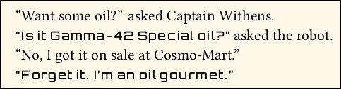
C. Example: Suppose your work is science fiction, and one if its characters is a talking robot. You wish to depict its utterances in a robotic-looking font, which will be called using a new \robovoice command. You shop around, and find that the Orbitron font suits your purpose, except that it is too large compared to your main font. So, you scale it.
In the Preamble, you define the new font command:
\NewFontFace\robovoice[Scale=0.8]{Orbitron} % not part of a family
After some experimentation, you realize that the \robovoice letters need to be spread apart a bit. Do not use \textls. Instead, go back and change the font definition like this:
\NewFontFace\robovoice[Scale=0.8,LetterSpace=number]{Orbitron} % pick a number
In the document body:
``Want some oil?'' asked Captain Withens.\par

{\robovoice ``Is it Gamma-42 Special oil?''} asked the robot.\par

``No, I got it on sale at Cosmo-Mart.''\par

{\robovoice ``Forget it. I'm an oil gourmet.''}\par
The result:
D. ![]() Caution: If you are using a new font within body text (as above), then it is a bad idea to use Scale greater than 1.0. Reason: An excessively tall font will cause lines to spread apart, and you will lose the line grid.
Caution: If you are using a new font within body text (as above), then it is a bad idea to use Scale greater than 1.0. Reason: An excessively tall font will cause lines to spread apart, and you will lose the line grid.
E. 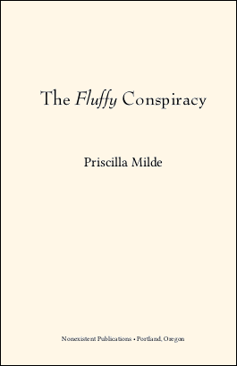 Example: Suppose that you wish to style the title of your book, in a font that is not used for other things such as chapter titles. You purchase a license for the Bernhard Modern Std fonts, in Regular and Italic.
In the Preamble:
\NewFontFamily\booktitlefont{Bernhard Modern Std}
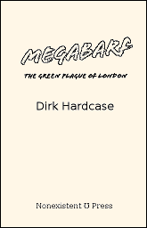
The title page, using \charscale for size:
\thispagestyle{empty}

\vspace*{7\nbs}

\begin{center}

\charscale[3]{\booktitlefont The \textit{Fluffy} Conspiracy}\par

\vspace{6\nbs}

\charscale[2]{Priscilla Milde}\par

\vfill

Nonexistent Publications • Portland, Oregon\par

\end{center}
4.3. Interior Page Layout
Everything is pre-configured, specifically for the purpose of fiction. You only need to write a layout command if you don't like the defaults.
4.3.1. Margins
Margins are globally set in Preamble:
\SetMargins{top}{outer}{bottom}{inner}
Mnemonic for order of margins (Hamlet): "TOBI, or not TOBI, that is the question."
Each of the settings must have dimension, such as in or mm.
A. Margins are required on all four edges of the page (but not cover art). They do not have to be the same width. Generally the margin at the inside edge (spine margin) is wider. The novel class does not provide for marginal notes.
B. In the case of fiction, it is usually the case that the inner margin is the widest. But this is not a rule for all books. All that is required is that each margin be "wide enough" for the printing process.
C. Print services are not used to seeing books with exotic margins (such as bottom margin twice the size of top margin). They may think that there is a mistake in your PDF, or in the print job, if you do that.
 D. Normally, your TeX document will be compiled to a PDF that is electronically at the exact Trim Size. And normally, print services want it to be that way. When you view your PDF, the text will shift from side to side as you move through the pages, due to the slightly increased margin at the inside edge.
E. Margins are always relative to the Trim Size. If you are using a larger Media Size, the area outside the TrimBox is not counted among the margins; it is simply wasted area. This is illustrated at right, where a smaller Trim Size is floated in a marger Media Size. The margins are shown in gray.
 F. If you do not use
 \SetMargins, then margins are pre-configured. The minimum pre-configured margins are 0.5in at top, outside, and bottom, and 0.75in at inside. This meets the requirements of nearly any printing technology, unless your book is extremely thick.
If your Trim Size is among the larger ones, then the pre-configured margins are larger than these minimums.
G. If your page layout uses header and/or footer, these elements sit within the rectangle bounded by the four margins. That is, they share the same space as main text.
At right, the top margin is shown in gray, for three situations. Layout #1 has a header. Layout #2 also has a header, but this particular page leaves the header empty. Layout #3 has no header.
4.3.1.1. Gutter? Which Gutter?
 Be aware that there is a lot of confusion regarding the word "gutter."
In the accompanying diagram, the central shaded area is at the spine, where there must be an allowance for the book assembly process. "Gutter" might mean any of A, B, C, or D, depending on who is doing the talking, and which software is in use.
The novel class uses inner margin, also known as spine margin, to mean C. There is no setting for "gutter" as such.
4.3.1.2. Unsafe Zone
Optional global setting, in Preamble:
\SetUnsafeZone{top}{outer}{bottom}{inner}
A. This applies only to interior text block. Although cover artwork has unsafe zones, they are specified by a graphic design template.
 B. Printers have a "safe zone," where you are allowed to place text and images. The area outside the safe zone is the "unsafe zone." If anything lies within the unsafe zone, even in part, then the file may print badly, or be rejected by commercial printers.
C. Unsafe zone is a sub-area of the margins. That is, the margins include the unsafe zone (if set), and usually some additional area. The accompanying image shows a page with narrow unsafe zone, and wider margin.
D. Some printers describe the unsafe zone as "minimum margin." But in most cases, visually appealing margins are wider than the unsafe zone. You may be able to place items out there, for special effects.
E. You do not need to set the unsafe zone. Whether or not you do, and regardless of any values you choose, the result does not affect the finished, final PDF. The zones are not enforced. Margins are unaffected.
F. If you set unsafe zone, then the unsafe area will have a dark gray background, when you use [draft,shademargins] as class options. This allows you to visualize whether anything intrudes into the unsafe zone.
4.3.2. Lines Per Page
A. Lines per page refers only to the textblock, and does not include header/footer. Lines are not stretched to fill short pages.
B. By default, a suitable number of lines per page are automatically set, based on other dimensions. You can change the default with this command, in Preamble:
\SetLinesPerPage{integer}
Any non-integer will be rounded. There is no direct command to set the leading, also known as line-to-line spacing or baselineskip. Instead, it is calculated from the textblock height and number of lines.
C. ![]() If you change any other dimensions (margins, head/foot, font size, etc.) then the calculated default number of lines per page will probably change. If you like the initial default value, then set it manually.
If you change any other dimensions (margins, head/foot, font size, etc.) then the calculated default number of lines per page will probably change. If you like the initial default value, then set it manually.
D. ![]() If the calculated leading is less than 1.2x the font size, an error will result. It is difficult for TeX to honor all layout settings with such a small leading, which would normally be unacceptable for fiction in any case.
If the calculated leading is less than 1.2x the font size, an error will result. It is difficult for TeX to honor all layout settings with such a small leading, which would normally be unacceptable for fiction in any case.
If the calculated leading is at least 1.2x the normal size, but less than 1.25x the normal size, then the log file will have an Alert message, suggesting that you should consider using fewer lines per page. If the leading exceeds 1.4x the font size, then the log will have an Alert, suggesting more lines per page. The Alert messages are friendly; you do not necessarily have to do anything.
4.3.3. Global Header/Footer Styles
A. Global choice of header/footer style is made in Preamble. Although some individual pages may have no visible header or footer, in reality the header/footer is "still there" in terms of occupying space, but has no content.
B. There are six pre-configured header/footer styles, numbered 1 through 6. These address every style I have seen in fiction. When you choose one of these styles, it reserves space for a header (if any) above the main text, and space for a footer (if any) below the main text. You may not write multi-line headers or footers.
C. The default style is 1, which has header, but no footer. Page numbers appear at the outside. Text (such as author or title) appears centered.
D. Style 0 has no header or footer. This is not used in fiction, but it is available.
E. Throughout the body of your document, you can use local commands to change the content of headers and footers, or blank them. But you may not change the global header/footer style mid-document.
4.3.3.1. List of Header/Footer Style Choices

\SetHeadFootStyle{1}
Only Header.
Page number at outside (left verso, right recto).
Optional emblem adjacent to page number.
Text centered. Default author verso, title recto.
This is the default for the novel document class.

\SetHeadFootStyle{2}
Only Footer.
Page number at outside (left verso, right recto).
Optional emblem adjacent to page number.

\SetHeadFootStyle{3}
Only Footer.
Page number centered.
Disregards emblem, if coded.

\SetHeadFootStyle{4}
Only Header.
Page number at outside (left verso, right recto).
Optional emblem adjacent to page number.
Text towards outside, instead of centered.
Text begins or ends 1em from the emblem.
Default author verso, title recto.

\SetHeadFootStyle{5}
Header and Footer.
Page number centered in footer.
Disregards emblem, if coded.
Text centered in header.
Default author verso, title recto.

\SetHeadFootStyle{6}
Only Header.
Page number at outside (left verso, right recto).
Optional emblem adjacent to page number.
Text towards inside, instead of centered.
Default author verso, title recto.
4.3.3.2. Custom Header/Footer Style
A. Before you think about writing a custom header/footer style, be sure to try the above pre-configured choices. I have looked through a lot of fiction of all kinds. The pre-configured choices include every style I have seen, with the exception of the most highly decorative.
B. If none of the above are satisfactory, then you can write your own headers and footers using the syntax of the fancyhdr package. Strategy:
• In the Preamble, you must use one of the above \SetHeadFootStyle choices to pick a starting point, in terms of whether or not there is a header and/or footer. This is required, so that the layout engine knows how to calculate space. After that, write the fancyhdr code for your custom header/footer in the Preamble. It will over-ride the numerical style in terms of appearance, but occupy the same space.
• You normally cannot use a header or footer with more than one line. If you have the expertise, two lines can be used, with sufficient jump. Not recommended, and not documented.
• See the file novel-HeadFootStyles.sty for how it is done in the pre-configured styles. In the file, the relevant portion follows Look here for the pre-defined styles, for use as models.
• Particularly note that your own style will not automatically use the head font, or add extra space between letters, unless you include the necessary code in your own definition. Do not use the \textls command.
• No cheating! If you choose a numerical style that does not have a header, then do not attempt to write a custom style that includes a header. Same with footer. Also, if you you choose a numerical style with both header and footer, then you cannot only customize one of them; you must customize both.
4.3.4. Tweaking the Global Header/Footer Style
You may customize the appearance, and to some extent the content, of the various parts of the header and footer. These are global settings, in Preamble.
4.3.4.1. Gap Between Header/Footer and Main Text
\SetHeadJump{number}, \SetFootJump{number}
A. These two commands control the separation between the header/footer and the main text. If your style does not have a header and/or footer, then the corresponding setting will be ignored.
B. The head and/or foot "jump" is a multiple of the normal baseline skip. Each value is a number between 1 and 3, and may be decimal. The jumps do not need to be identical. Default is 1.5 for each. Measurements are from baseline to baseline.

 C. When a "jump" is changed, its header or footer remains in the same place. The margins are unchanged.
D. ![]() If you manually choose the number of lines per page, then it will remain the same when you change "jump." The inter-line spacing (baselineskip) will change.
If you manually choose the number of lines per page, then it will remain the same when you change "jump." The inter-line spacing (baselineskip) will change.
However, if you allow novel to use the default number of lines per page, then it will change when "jump" is changed.
E. Note that novel does not use arcane settings such as headsep, footskip, or headheight. Those TeX internals are automatically calculated.
F. The distance from the topmost baseline (whether header or main text), to the top margin, is fixed at 1 normal em. This provides adequate clearance for capital letters with upper diacritical marks.
The distance from the lowermost baseline (whether main text or footer), to the lower margin, is fixed at 0.3 normal em. This provides adequate clearance for descenders.
G. When in draft mode, the shademargins option shades the margins in medium gray, and shades the area reserved for header/footer in light gray. This was used in the above image.
H. ![]() The head/foot jumps are global, and cannot be changed later in the document.
The head/foot jumps are global, and cannot be changed later in the document.
4.3.4.2. \SetHeadFont[features]{font}
A. The novel pre-configured header/footer styles automatically use the head font, which is pre-defined as a variation of the parent font: scaled to slightly smaller size, using lining numbers (if available), and small caps (if available). This is a general-purpose style, widely used in fiction. It may not be the most artistic, but it is unlikely to cause visual distraction:

B. If you would like to use something else as head font, use \SetHeadFont to define it by its font name and Open Type features.
In the simplest case, you merely pick an Open Type (or TrueType) font, and novel automatically adds some Open Type features, including small caps:
\SetHeadFont{Roboto}

C. The above example is not best if your style has header text, because the head font is too pronounced, compared to the main text. A more complex example uses fontspec syntax to customize the Open Type Features:
\SetHeadFont[Scale=0.75,Numbers=Lining,%

Letters=SmallCaps,%

Letters=UppercaseSmallCaps,%

ItalicFont=Montserrat-ExtraLightItalic.otf]%

{Montserrat-ExtraLight.otf}

D. ![]() If you do not want SmallCaps to be automatically added, use
If you do not want SmallCaps to be automatically added, use Letters=ResetAll as a feature:
\SetHeadFont[Letters=ResetAll]{\parentfontname}
4.3.4.3. \SetLooseHead{number}
A. This command applies to both headers and footers, but its effect is most noticeable when the style has header text.
B. For best appearance of header text, its characters should be adjusted with a little extra space (tracking) between them, so that they are more easily distinguished from the main text. This is especially true if you are using small caps.
C. The argument of \SetLooseHead is a number from 0 to 200. At 0 there is no extra space between the letters. Values from 50 (default) to 100 are most useful.
D. Page number tracking will be clamped at a maximum of 50, even when a larger (looser) tracking is applied to text.
E. ![]() Do not use the
Do not use the \textls command. It is disabled in novel.
4.3.4.4. \SetPageNumberStyle{code using \thepage}
A. By default, the page number is styled using head font, but without small caps (so that page roman xiv does not show as XIV).
B. If you wish to change how the page number is displayed, you can style it using \SetPageNumber with an argument that uses \thepage. Examples:
\SetPageNumberStyle{\textit{\thepage}} % Page number in italics.

\SetPageNumberStyle{-- \thepage{} --} % En-dashes, style 3 or 5.
C. The head font is applied automatically, unless you over-ride it in your code. For example, suppose you would like the page numbers (but not anything else in header/footer) to be in a different font, which you have defined in Preamble as \yourpnfont using \NewFontFamily or \NewFontFace. Then you could write:
\SetPageNumberStyle{{\yourpnfont\thepage}} % note double braces
D. ![]() Avoid over-doing it. If you are tempted to use a macro that counts page numbers backwards, or writes them upside-down, be aware that your print service will likely reject it. Anyway, it has already been done in fiction.
Avoid over-doing it. If you are tempted to use a macro that counts page numbers backwards, or writes them upside-down, be aware that your print service will likely reject it. Anyway, it has already been done in fiction.
4.3.4.5. \SetEmblems{verso}{recto}
A. If the head/foot style supports it, you may place an "emblem" that appears at a fixed distance (2.5em) from the outer margin. Thus, it will appear to the right of the page number on verso pages, and to the left of the page number on recto pages. In the case of style 4, there will be a clearance of 1em between the emblem and the header text.
B. Emblems are minor decorations that should not distract the eye from the main text. If the style supports emblems but you do not set them, then no emblems are placed.
C.  Most books do not use an emblem. When they do, it is typically a vertical bar, or a bullet, like this:
\SetHeadFootStyle{4}
\SetEmblems{|}{|}
D. The font used for emblems will be the same as the head font, unless you specifically code the emblem to use a different font, or unless you use one of the built-in \decoglyph codes.
E. The verso and recto emblems may be different. If you set one side, you must also set the other. Blanks are allowed.
F.  Emblems may be styled. For example, the header emblems shown at right were produced using the code below. Dingbats from the NovelDeco font were specified, adjusted for size and position.
\SetEmblems{\charscale{1.1}{\raisebox{-0.05em}{\decoglyph{l9825}}}}%
{\charscale{1.1}{\raisebox{-0.05em}{\decoglyph{l9826}}}}
G. You may also use images, or combined images and text. If you use images, they must be at the exact resolution required by your print service (typically 300dpi for gray, 800dpi for b/w), and at exact size without scaling. The \InlineImage command must be used. You may find that a vertical offset of \nfs (normal font size) is useful, as this will place the top of the emblem image at the top margin.
\SetHeadFootStyle{4}

\SetEmblems{\InlineImage[0pt,b]{spy.png}}%

{\InlineImage[0pt,b]{spy.png}}
H. ![]() At the small size of an emblem, it is difficult to use detailed artwork. A black/white image at 800dpi will print similarly to a font dingbat. Grayscale at 300dpi will probably not be satisfactory unless the emblem is a single shade of gray. For the above example, a character from the Fontawesome font was converted to a png image at mid-gray. It is less distracting than a black character from the font, but hard to discern. Note that "gray ink" will not be used for your book.
At the small size of an emblem, it is difficult to use detailed artwork. A black/white image at 800dpi will print similarly to a font dingbat. Grayscale at 300dpi will probably not be satisfactory unless the emblem is a single shade of gray. For the above example, a character from the Fontawesome font was converted to a png image at mid-gray. It is less distracting than a black character from the font, but hard to discern. Note that "gray ink" will not be used for your book.
Ask your print service whether the presence of a small image in each page header will affect production costs. Probably not, but if there is a different per-page charge when pages have an image... Oops!
I. ![]() The layout calculation does not care whether emblems intrude into the margins. You will have to inspect your PDF to determine whether a header emblem is too tall, or a footer emblem too deep, for the allowed top and bottom margin clearance. Class option shademargins (in draft mode only) is helpful.
The layout calculation does not care whether emblems intrude into the margins. You will have to inspect your PDF to determine whether a header emblem is too tall, or a footer emblem too deep, for the allowed top and bottom margin clearance. Class option shademargins (in draft mode only) is helpful.
4.3.4.6. Setting and Changing Header Text
A. If you are using head/foot style 1, 4, 5, or 6, it has text in the header. By default, that text is the author on verso pages, the title on recto pages. That is an accepted design for fiction, but it is not always the appropriate thing to do.
For example, in exotic cases you may use something such as \SetTitle{ISBN9780123456789TEXTBLOCK}, instead of the book's actual title, if required for the printer's database. Obviously you do not want that to appear in page headings!
B. Header text may be changed to whatever you wish (as long as it fits):
\SetVersoHeadText{text}
\SetRectoHeadText{text}
C. These commands can be used both in Preamble and in the document body. Whatever you set will take effect immediately (for pages that have header text) and remain in effect until changed by repeating these commands. For example, you might want to do that for a collection of short stories, or if your book has a Preface.
D. You may use ordinary LaTeX styling commands for the text:
\SetRectoHeadText{The \emph{Bad Boy} Chronicles}
You may also do more complicated things, such as setting certain words in a font other than the head font. This is not advised, because you do not want to distract the reader from the main text; but it can be done.
E. ![]() Avoid bold. Avoid underline. Really. Don't do it. No, no, no!
Avoid bold. Avoid underline. Really. Don't do it. No, no, no!
4.3.5. Header/Footer Exceptional Pages
There are a number of cases where a specific page must have a header/footer style that appears to differ from the global style. The key words are "appears to differ." The global header/footer is always there, in terms of vertical space. But either or both may be blank, or have unusual content, on certain pages.
4.3.5.1. \thispagestyle{choice}
A. Command \thispagestyle is used in the document body, not Preamble. It changes the appearance of header/footer, only for the page on which the command appears. Ideally the command is used immediately after \clearpage or \cleartorecto, so that the applicable page is certain.
B. The command will be effective if used anywhere on a page, as long as you are certain which page is current. So, if you know that a particular portion of text runs exactly two pages before \clearpage, you can use \thispagestyle at the beginning and end of the text, so that it applies to both pages.
C. The choice of page style is not one of the numbered global head/foot styles. Instead, choose from the following list. These are more versatile than the choices available in other TeX document classes. They are: fancy, empty, footer, forcenumber, dropfoliobeneath, and dropfolioinside. If you choose plain, you will get footer, but that might not be what you want.
\thispagestyle{fancy}
This applies the default (fancy) page style, so it is not normally needed. Only use this command to over-ride some other \thispagestyle command, or to over-ride the \SetChapterStartStyle setting.
\thispagestyle{empty}
Header and footer are both blank.
\thispagestyle{footer}
Ignored if the style has no footer. If it does, then the usual footer appears. Note that this does not cause a page number to appear, when the style has no footer. Header, if any, is blank.
\thispagestyle{forcenumber}
If the style has a footer, then it appears as usual, and the header (if any) is blank. If the style has a header but no footer, then the outside portion of the header (which is presumed to contain the page number and emblem) appears, but the text portion of the header is blank.
• The forcenumber choice is non-standard. Use it only if you must have a page number, and no other choice is suitable.
\thispagestyle{dropfoliobeneath}
In this context, "folio" means page number. The header (if any) is blank. If there is a footer, then it appears as usual. But if there is no footer, this command creates a one-page fake footer, which contains the centered page number. The fake footer is located where the next line of text would be, if the textblock were one line longer than its actual value.
• For the fake footer to be acceptable in print, the bottom margin must be wider than the minimum amount required by your print service. For example, suppose that the minimum bottom margin is 0.5in, but you set the bottom margin to 0.75in. That gives you 0.25in wiggle room, into which the fake footer will probably fit, because typical baselineskip is 0.2in to 0.25in.
• The document class does not know whether or not you have extra space available in the bottom margin. It is your responsibility to know.
\thispagestyle{dropfolioinside}
In this context, "folio" means page number. The header (if any) is blank. If there is a footer, then it appears as usual. But if there is no footer, this commands temporarily reduces the number of lines per page by one. At the bottom, where the last line of text would normally be, the page number is centered. Thus, there is no intrusion into the bottom margin.
• This command may only be used following \clearpage. Thus, it may be used at the start of new chapters, or on pages that do not flow from a previous page. If you use it elsewhere, the print will have incorrect layout, but there will be no error or warning, since the compiler is not sure what you are trying to do.
• If used on a page with ChapterStart environment, you must place \thispagestyle{dropfolioinside} before \begin{ChapterStart}. Reason: The ChapterStart block has a disposable blank line at its top, which is removed when dropfolioinside is used (instead of removing a line from the following text block).
• With this style, the specified height of ChapterStart must be 4 or more. This command will reduce it to 3 or more.
4.3.5.2. \SetChapterStartStyle{choice}
A. The first page of each chapter, or of a section that is styled like a chapter, is usually an exception to the global page style.
B. In Preamble, \SetChapterStartStyle sets the default thispagestyle that will be applied on pages with the ChapterStart environment. You may still over-ride locally.
B. The choices are the same as available for \thispagestyle. Default is footer.
5. Chapters and Chapter-Like Sections
This section describes how chapters are designed. The novel class has commands specifically for this purpose. Do not use the ordinary TeX \chapter command, or any other TeX partitioning such as \section.
This also applies to content that is styled like a chapter, regardless of what it is called or where it appears. For example, if your book's front matter has a Preface, it is probably styled like a chapter. Something such as Acknowledgements might or might not be styled like a chapter, depending on length. Advice can be found in section 8 of this documentation, regarding Book Design.
5.1. Starting a Chapter
Unlike most other TeX document classes, novel does not honor the \chapter command. And, novel does not automatically start chapters on a new page.
5.1.1. \clearpage or \cleartorecto
A. Unless your chapters run continuously without page break, begin a new chapter using \clearpage or \cleartorecto. The first of these provides a new page, which will be verso or recto, without skipping a page. The second forces the chapter to begin on a recto page, if necessary inserting a blank verso.
B. The common modern practice in fiction is to allow new chapters to begin either verso or recto, once you get past Chapter One. The only recent book I've read (from a major publisher), where chapters always started recto, had about 20 blank pages throughout the story. I believe the reason was to pad the book, so that it looked bigger. If you are using an American P.O.D. service, such padding might knock about $0.10 (estimated) from your profit, for each copy sold. So it's up to you to think about the tradeoffs between style, profit per book, and expected sales.
C. Prologue (if any), Chapter One, Epilogue (if any), and other special sections always begin recto.
D. ![]() Don't worry about using
Don't worry about using \clearpage or \cleartorecto twice. The compiler is smart enough to understand that you only meant to do it once, as long as there is no other code in between.
5.1.2. ChapterStart Environment
A. The ChapterStart environment creates a block of white space, with a fixed height (number of normal lines). If you do not place much inside it, or even if you place nothing inside it, the space is the same.
B. If you place too much inside it, the space does not grow. Instead, the excess material overflows the bottom of the environment. There, the excess will underlie the main text. This is usually undesirable, but can sometimes be used for special effects.
5.1.2.1. \SetChapterStartStyle{choice}
A. This command may be used in Preamble. Its default setting is footer.
B. In most cases, a ChapterStart page has a head/foot style that differs from the global default. Instead of writing \thispagestyle commands for every chapter, use \SetChapterStartStyle to pick a style that will be applied wherever ChapterStart is used. The available choices are: fancy, footer, empty, dropfoliobeneath, dropfolioinside, forcenumber.
C. Regardless of this setting, you can over-ride the style on a per-chapter basis, via an optional argument at the beginning of the ChapterStart environment.
5.1.2.2. \SetChapterStartHeight{lines}
A. This command may be used in Preamble. Its default setting is 10.
B. This command sets the default height of the ChapterStart environment, measured as an integer number of normal lines. The smallest value is 3.
C. However, if the chapter also uses dropfolioinside, then the smallest value is 4, because one line is lost when processing the dropfolioinside command.
D. Regardless of this setting, you can over-ride the height on a per-chapter basis, via an optional argument at the beginning of the ChapterStart environment.
5.1.2.3. \begin{ChapterStart}[lines][style]
A. The ChapterStart environment takes up to two optional arguments.
B. The first optional argument over-rides the default height of ChapterStart, for just this chapter. Its smallest value is 3, except that its smallest value is 4 when dropfolioinside is used.
C. The second optional argument over-rides the header/footer style, for just this chapter. If you use the second optional argument, it must be one of the allowed choices for \thispagestyle, namely: fancy, footer, empty, dropfoliobeneath, dropfolioinside, forcenumber.
D. To use the second argument without the first, place an asterisk: [*][style]
E. Whatever you place within ChapterStart will probably be higher on the page than you would like. To move it down, use the \vspace*{length} command (with asterisk) immediately after the environment begins.
As with all environments, this one must be closed using \end{ChapterStart}.
5.1.3. Chapter Title, Subtitle, Deco, Epigraph
You can put anything you like within ChapterStart, including ordinary text and even images. All ChapterStart does is reserve a fixed space. However, there are special commands that make it easy to place a chapter title, chapter subtitle, and decorative element.
5.1.3.1. \SetChapterFont[features]{font}
5.1.3.1 \SetSubchFont[features]{font}
A. These global commands may be used in Preamble. They create font commands \chapterfont and \subchfont that may be used to style text anywhere in your document, like this:
{\chapterfont text}

{\subchfont text}
B. The chapter font is automatically applied to text in \ChapterTitle commands.
C. The subch font is automatically applied to text in chapter subtitles (see below).
D. These fonts are pre-configured, based on the document's parent font. They have TeX ligatures and kerning, and use Lining numbers instead of Old Style. The chapter font is scaled at 1.6, and the subch font is scaled at 1.2, compared to normal font size. Ordinary (common) ligatures are not used, because such ligatures are best avoided with enlarged text.
E. If you don't like the pre-configured fonts, then you may specify your own, using fontspec syntax. Here is what the default codes look like:
\SetChapterFont[Numbers=Lining,Scale=1.6]{\parentfont}

\SetSubchFont[Numbers=Lining,Scale=1.2]{\parentfont}
5.1.3.2. \ChapterTitle[alignment]{text}
5.1.3.2. \ChapterSubtitle[alignment]{text}
A. Text within \ChapterTitle is styled using the chapter font, and text within \ChapterSubtitle is automatically styled using the subch font.
B. You can locally over-ride these fonts, using font commands in the text.
C. The optional alignment controls how the element is horizontally placed. Choices are l, c, r (left, center, right). Default c.
D. You don't have to use either of these commands. Or, you can use either of them more than once! All these commands do is style the text. They do not have any meaning that is controlled by other macros.
E. The styled text is limited to one line (no wrap) per command. If you have a long chapter title or subtitle, then break it into pieces of manageable size, by repeating the command(s). Example:

\begin{ChapterStart}

\vspace{2\nbs}

\ChapterTitle[l]{XV}

\vspace{\nbs}

\ChapterSubtitle[l]{In which Lord Withens, returned from his quest,}

\ChapterSubtitle[l]{encounters an Army of Gnomes at his castle gate.}

\end{\ChapterStart}

Following the dark and stormy night, it was a bright and sunny day. That did nothing to improve the demeanor of Lord Withens, who was still soaked from riding through the rain. ...\par
5.1.3.3. \ChapterDeco[alignment scale]{text}
A. This command is simply a way for you to remember that its content is neither the title nor subtitle of the chapter. Typical usage is to place a decorative element.
B. There is a single command option, which is parsed for a letter and/or a number, with our without comma or space. The alignment letter is one of l, c, r (left, center, right). Default c. The numerical scale (may be decimal) changes the size of the text, and tweaks its vertical position. Default scale is 1.
C. For your convenience, the NovelDeco font (included with novel has a few possibilities. they are accessed via the \decoglyph command. The list of available decorations, and codes to access them, are in the file NovelDeco-glyphs.pdf, which is in the extras folder within this documentation. Note that the decorations can be placed anywhere in your document, not just in \ChapterDeco.
D.  Most of the
 \decoglyph decorations look best when the optional scale is near 4. Example:
\begin{ChapterStart}[8]

\vspace{2\nbs}

\ChapterTitle[l]{3}

\ChapterSubtitle[l]{The Low-Down}

\ChapterDeco[l4]{\decoglyph{n9591}\decoglyph{r9656}}

\end{ChapterStart}

I didn't hear the low-down until the following Saturday. By then, all hell had broken loose at Vinny's joint, and the boys were looking for me in trash cans, just in case that was where I was hiding, or maybe dead. ...\par
5.1.3.4. Chapter Epigraph
A. If you would like to place an Epigraph within ChapterStart, there is no special command for that purpose. You do it the same way you would do it anywhere else: Use the adjustwidth environment to limit the text width. You may use the parascale environment to scale the block of text, without disturbing the following line grid, as long as you are within ChapterStart.
B. Example:

\begin{ChapterStart}

\vspace{2\nbs}

\ChapterTitle{16. The Great Incantation}

\vspace{\nbs}

\begin{adjustwidth}{4em}{4em}

\begin{parascale}[0.88]

In the third moon of the third raveling, in the third hour of the third day, Fingly shall come again.\par

\stake\hfill \textit{Book of Beirh}\par

\end{parascale}

\end{adjustwidth}

\end{ChapterStart}

In the latter days of the Dorf dynasty, a marvelous apparition sent the King's guard scrambling in terror. Elders soon declared that it was the return of Fingly, prophesized in the Book of Beirh. ...\par
C. ![]() It is not necessary to load the epigraph package. Simply construct your own style of epigraph using other methods. But if you do load epigraph: Only use
It is not necessary to load the epigraph package. Simply construct your own style of epigraph using other methods. But if you do load epigraph: Only use \epigraph, or the epigraphs environment, within the ChapterStart environment, or on a display page. Commands \epigraphhead, \dropchapter, \undocrop do not work in novel. The \cleartoevenpage[option] command does work. Ignore the material regarding epigraphs on part pages or in bibliographies.
5.1.4. ChapterStart With Image
A. You can use an image in chapter titles. If you place an image, use one of the image commands defined by novel elsewhere in the documentation.
B. Be sure that you are licensed to use the image. Many clipart catalogs "for personal use only," prohibit usage in commercial books. One possible source is openclipart.org (note the .org).
5.1.4.1. Text Over Inline Image
A.  You may position text over an
 \InlineImage. You must use black text, or grayscale text that is much darker than the underlying image.
B. Example: Here, the command \unifrac calls for the font UnifrakturMaguntia.ttf. Note that the font command is outside \charscale:
\begin{ChapterStart}

\FloatImage{sword.png} % centered by default

{\unifrak\centering\charscale[3,0pt,4\nbs]{35}\par}

\end{ChapterStart}
5.1.4.2. Text Built Into Image
A. If the text is not much darker than the background image, then it is better to include the text as part of the raster image. The reason is that "white ink" will not be used for your book. Also, you cannot use image transparency.
B. Example: The number is built into the image itself.

\begin{ChapterStart}

\FloatImage[l]{smfingerprint8.png}

\end{ChapterStart}
5.2. Continuously Running Chapters
Standard book design calls for each chapter to begin on a new page. However, some books are designed with numerous short chapters that run continously, so that chapters may start anywhere on a page. There are two ways to handle this in novel, or you can simply design your own method.
5.2.1. Reduced-Height ChapterStart
A. Since the ChapterStart environment does not automatically begin a new page, you can use it for continuously running chapters. In Preamble, set a short height, such as \SetChapterStartHeight{4}. Also use \SetChapterStartStyle{fancy} so that headers don't disappear.
B. Throughout the book, you can make local adjustments to the ChapterStart height, so that they don't fall at an inconvenient location (such as at the bottom of a page). Yes, I have seen this done in published works. If a particular chapter is sufficiently important that it deserves a page break, or a lot more space, you can do that easily.
5.2.2. \QuickChapter[linelength]{chapter title}
A. The \QuickChapter command inserts two blank lines. In the gap, the chapter title is left-justified using subch font (not chapter font). It is slightly raised from the normal baseline, because this looks better; but the following text is back on-grid. By default, the start of the following text will be un-indented.
B. If the optional linelength is provided, then a dash will be written after the title, at the position and thickness typical of the em dash in subch font. If linelength is specified in units of length, then that will be the length of the line. But if linelength is an asterisk, then the line will fill to the right margin.
C. \QuickChapter is probably too obtrusive, for mere scene changes within a chapter.
D. Example:
Then he looked at me with a sneer, and barked, “You better haul your can over to Vinny's joint, before the Boss finds out.”\par

\QuickChapter[3em]{16. At Vinny’s}

So I took his advice, and hauled my can over to Vinny’s. It was everything I had expected, and worse.\par

The bouncer wasn't the biggest one I’d ever seen, but he was the ugliest. ...
5.3. Scene Breaks
A. There are several commands dedicated to the purpose of scene breaks.
\scenebreak inserts a one-line blank skip. The following line of text is not indented.
\sceneline inserts a one-line skip, containing a short centered line. The following line of text is not indented.
\scenestars inserts a one-line skip, containing three spaced, centered asterisks. The following line of text is not indented.
B. Examples:
\noindent It was a dark and stormy night.\par

Lord Withens, the last of his line, hurried through the gloom to Castle McWhistle, where Lady McWhistle awaited.\par

\scenebreak

Well, maybe it was not very dark.\par

But to Lord Withens, it seemed dark enough. Or rather, he hoped it was dark enough. Lord McWhistle was suspicious.\par

\sceneline

Actually, it was not all that stormy, either. But the Withens clan never tolerated drizzle, much less a storm.\par

Who could blame them? It's not like they lived in Italy.\par

\scenestars

Ah, such ill fortune haunted the Withens!\par

Unfortunately, novelists of that era had so little to write about, or they would have chosen another family to pursue.\par
C. A badly-placed scene break will be detected, and a Warning message will be issued.
If \scenebreak is positioned at the very top or bottom of a page, then the Warning will advise you to substitute it with either \scenestars or \sceneline. The substitution is not automatic.
If any of scenebreak, \sceneline, or \scenestars appears just one line away from the top or bottom of a page, you will get a Warning.
5.3.1. \SetScenebreakIndent{true or false}
This global command may only be used in the Preamble. Default is false.
Normally, text begins without a paragraph indent, after each scene break. This is standard in fiction. If you prefer that each new scene begins indented, use this command. It works only with \scenebreak, \sceneline, and \scenestars.
5.4. Automatic Chapter Numbering
By popular demand, here is how to add automatic chapter numbering, even though it is easier to just type Chapter One or whatever you need:
A. Counter novelcn is pre-defined, and initialized to 1 (not zero). If you simply wish to print its value as a number, then increment the count, do something like this:
\ChapterTitle{Chapter \the\value{novelcn}\stepcounter{novelcn}}
That will print Chapter 1, Chapter 2, and so forth. Of course, only do this for real, numbered chapters, not for "chapter-like" sections. If your book has several parts, and each part re-sets its own chapter count, use \setcounter{novelcn}{1} prior to the first chapter in each part.
B. If you would like the number to be spelled out, as in Chapter One, Chapter Two, and so forth, then try the fmtcount package. It can also do ordinals such as First Chapter, Second Chapter. See the fmtcount package documentation for details.
C. If your document's language is other than English, set it before you load the fmtcount package. If you do it later, then positioning will be incorrect.
D. Example: With fmtcount loaded in Preamble.
% if necessary, use set language first.

\RequirePackage{fmtcount}
Example usage in chapter titles:
\ChapterTitle{\Ordinalstring{novelcn}\stepcounter{novelcn} Robbery} %1

\ChapterTitle{\Ordinalstring{novelcn}\stepcounter{novelcn} Robbery} %2

\ChapterTitle{\Ordinalstring{novelcn}\stepcounter{novelcn} Robbery} %3

5.5. First Lines and Drop Caps
The first line of chapter text is often treated with a style of its own. Often, all or part of the first line is in small caps. The first letter may be larger than the rest. Or, the first letter may occupy several lines (sometimes using an image). This last effect is known as drop cap (French lettrine).
5.5.1. First Character Special
A. Use the \charscale command to size the first letter (or more than one letter) so that it stands above the remainder of the line. Remember that you will see a capital letter standing next to lowercase letters, so it will appear taller. You may also use a font command.
B. Example: Where \NewFontFace\alexbrush{AlexBrush-Regular.ttf} appears in Preamble.
\noindent\charscale[1.6]{\alexbrush I}\hspace{0.2em}t was a dark and stormy night. Well, it really wasn't all that dark, seeing as how this story is set in Las Vegas.

5.5.2. First Line Small Caps
A. If you want to place a portion of the first line in small caps, then simply do it using \textsc{text}. This effect can also continue to additional lines. That is, it does not automatically stop at the end of the first line.
B. The magaz package is pre-loaded in novel. It provides the \FirstLine command, which takes the entire first paragraph as its argument. Place \noindent inside. You may also style the first letter (or more than one) as described above; the styled letter appears inside the \FirstLine command.
C. Example:
\FirstLine{\noindent\charscale[1.6]{\alexbrush I}\hspace{0.2em}t was a dark and stormy night. Well, it really wasn't all that dark, seeing as how this story is set in Las Vegas.}

5.5.3. Drop Caps
A. The drop cap is an enlarged letter (or image) at the beginning of chapter text, with the first few lines of text wrapped around it:

B. Works of popular fiction rarely use drop caps. Instead, having a special first character (section 5.5.1) is more common, as it presents fewer layout problems, and is less distracting.
C. ![]() The
The \dropcap command is native to novel. You may also load and use lettrine. An extensive discussion of drop caps is in Appendix F.
6. Text Sizes and Styling
This section describes how to change the size of text, how to style text (such as italics), and how to move it around. It also describes some miscellaneous commands that are intended to modify text.
A. Information about how to choose the global, main text point size is described in section 4.2.1.2. General information about choosing fonts and font features is in Appendix C and Appendix E. Styles particularly used at chapter openings are described in section 5.
B. There is no direct setting for normal baselineskip; it is automatically calculated from the size of the textblock (using Trim Size, Margins, and header/footer layouts) and lines per page.
C. The included microtype package is pre-configured, using these settings:
\microtypesetup{config=novel-microtype,final,stretch=20,shrink=20}
File novel-microtype.cfg uses settings typical of the kind of book-weight font that you are likely to use. The stretch and shrink factors are moderate. Calculation is always final, so that you see the same effect whether or not you use the draft class option. If you wish to change any of these, see the microtype package documentation. Note that since you are compiling with LuaLaTeX, some features of microtype may not be available.
6.1. Text Sizes
Be sure to read through this. In novel, standard TeX font size commands are disabled. There are new commands that address the limited needs for font sizing, in the context of fiction. These new commands are primarily for local adjustments of a few characters, or for display pages that are outside the main flow of text.
6.1.1. Surprise! Traditional TeX Font Size Commands Are Disabled.
A. Standard LaTeX font size commands, such as \small and \LARGE, are disabled in novel. If you use them, they will be ignored, and the affected text will be printed without modification. This is by intent, for the purpose of maintaining the baseline grid.
B. The one exception is that footnotes will appear with smaller than normal size and skip. But this is done automatically. You cannot manipulate it with a size command.
C. Use novel's own commands for manipulating font size. The correct command depends on the quantity of text involved.
6.1.2. \charscale[scale,hoffset,voffset]{text, but not image} and starred
A. The contents of \charscale{} occupy no vertical space. Thus, scaled text does not push baselines apart. Excessive scale may cause characters to overlap; in some cases this is a desirable special effect.
B. The optional argument has up to three comma-separated components. The first is a number, which scales the text relative to its natural size. If the text was already scaled by some other operation (such as using fontspec to define the font with Scale feature), then the effect is cumulative.
Do not use a scale close to zero, or negative. The result is unpredictable.
C. \charscale may be used for a short amount of text, where there is no line break, and no wrap. The command will throw an error if the included text has \\ or \par or any other method that breaks the line.
Excessive text will not wrap. It will overflow into the right margin.
D. Example: In this example, line 4 is so enarged that its ascenders and descenders overlap other text.

Jack be quick. (1)\par

\charscale[1.2]{Jack be quick.} (2)\par

\charscale[1.5]{Jack be quick.} (3)\par

\charscale[2.5]{Jack be quick.} (4)\par

\charscale[1.2]{Jack be quick, JACK} (5)\par
E. The second optional component, if used, is horizontal offset. The third optional component, if used, is vertical offset. Offsets are lengths, measured in units such as em or \nbs.
F. In its starred form, the contents of \charscale*{} occupy neither vertical nor horizontal space. Example:

Alpha \charscale[1.25]{Beta} Gamma. (1)\par

Alpha \charscale[1.25,8em,1.3\nbs]{Beta} Gamma. (2)\par

Alpha Gamma. (3)\par

Alpha\charscale*[1.25,8em,1.3\nbs]{Beta} Gamma. (4)\par
In line 1, Beta is enlarged, but not offset. It occupies slightly more width than it would have occupied unscaled. In line 2, Beta has been offset. Since the unstarred \charscale was used, the horizontal space is still there.
Line 3 has no Beta. Line 4 uses the starred \charscale* to offset Beta, but no width is left behind. Note that the space between Alpha and Gamma is an ordinary inter-word space, because there is a space following the command.
G. \charscale is very effective on display pages, where you can scale and move text however you wish. The starred version is especially useful, since back-to-back \charscale* will place text from a single vantage point.
H. In main text, the most practical application of \charscale is to enlarge the first character of chapter text. See section 5.5.1. Otherwise, the command is rarely used, mostly for local correction of characters that need some size adjustment.
I. ![]()
\charscale does not commute with some other TeX commands. That is, the results of \charscale{\othercommand{text}} and \othercommand{\charscale{text}} may differ.
6.1.3. \begin{parascale}[scale] ... \end{parascale}
A. The parascale environment is used on a paragraph basis. More than one paragraph may be included. The scale is applied to the font size and to the baselineskip within.
Note that the scale is an optional argument. Default is 1.
B. The parascale environment is allowed to cross page boundaries.
Trick: If you place an ordinary paragraph in parascale at scale 1, then you will know whether or not that paragraph remains on one page.
C. For scale less than or equal to 1, the first line in parascale will be at the normal baseline position. The following lines will progressively depart from the normal grid (unless scale is 1). Thus, you will usually need to add some amount of vertical space following parascale, in order to restore subsequent text to the line grid.
D. You will usually get a Warning message, advising you that parascale caused the subsequent text (after the environment closed) to be off-grid. Fix by adding the requisite \vspace just prior to \end{parascale}.
If parascale is entirely on a single page, you may also split the \vspace: Place part of it prior to \begin{parascale}, and part of it prior to \end{parascale}.
E. If multiple parascale end on a single page, the line deficit is cumulative. For example, if the first deficit is 0.5\nbs and the second defict is 0.8\nbs, you would fix them by adding 0.5\nbs and 0.3\nbs respectively.
E. Example:
Lord Withens sneaked out the door of the veranda, and hastily opened the letter. In it was a message that curled his jodphurs:\par

\begin{parascale}[0.87]

We knows where youse been a-goin all a them dark and stormy nights. We knows what you been doin out there. We got yer number, Jack. So youse better play nice or we gonna rat to the lady.\par

\vspace{0.26\nbs} % Without this, a Warning is issued, adivisng 0.26\nbs.

\end{parascale}

Even after his jodphurs had finally uncurled, Lord Withens could not master his rage. ``My name's not Jack,'' he mumbled.\par

6.1.4. Open Type Scale (fontspec)
A. If you will be using a font in a way that it will always be at a size different from the normal font size, you may use the Scale feature when you first define the font. This is defined by the fontspec package, which is automatically loaded with novel. Example:
\NewFontFamily\minifont[Scale=0.75,Numbers=Lining]{\parentfont}
B. The scaled font can be used anywhere. It is not limited to a single line, and it will maintain the line grid at scales not exceeding 1.
C. ![]() Scaled text may disturb the line grid, if its scale is more than 1.
Scaled text may disturb the line grid, if its scale is more than 1.
6.2. General Styling
Many of these commands are directly from LaTeX, and are mentioned here because they are frequently used. Other commands are specific to novel.
6.2.1. Italics and Emphasis
A. \itshape{text, may cross paragraphs} is a general-purpose command for italics.
B. \textit{text} will not cross paragraphs.
C. \emph{text} changes regular text to italics, and italic text to regular. You may nest \emph commands. Many writers opine that this is the preferred way to specify italics. It cannot cross paragraphs.
D. If the italicized text leans too far into the following space, try adding \/ (back and forward slashes) just before closing the braces.
E. ![]() Italics are not faked (such as by slanting). If the font does not have an italic font file, then regular text will appear. You may use fontspec syntax to substitute a different italic font, if necessary. See Appendix E.1.1 file name combinations.
Italics are not faked (such as by slanting). If the font does not have an italic font file, then regular text will appear. You may use fontspec syntax to substitute a different italic font, if necessary. See Appendix E.1.1 file name combinations.
6.2.2. Bold, Semibold, etc.
A. \bfshape{text, may cross paragraphs} is a general-purpose command for bold.
B. \textbf{text} will not cross paragraphs.
C. The default main font in novel is Libertinus Serif, which has both bold and semibold weights. In versions prior to 1.80 (2023), The semibold weight is pre-configured to substitute for bold. Version 1.80 does not make this substitution.
D. If you use a different font, and it has an alternative to bold weight, see Appendix E.1.1 file name combinations for how to configure the choice. Bold is not faked by thickening.
E. ![]() Bold is rare in fiction. It might be the case that this weight is useful for titles, but you ought to consider a fancy-looking font for that purpose, rather than mere Bold. Or, make the letters big and bold, but balance the effect by using gray.
Bold is rare in fiction. It might be the case that this weight is useful for titles, but you ought to consider a fancy-looking font for that purpose, rather than mere Bold. Or, make the letters big and bold, but balance the effect by using gray.
6.2.3. Underlining
Underlining is inappropriate for fiction. Don't do it. Besides, there are some issues regarding line grid and appearance, which are not a problem in academic works, but are noticeable in fiction.
If you are using a line for its graphic effect, the \bigemdash command might be helpful.
6.2.4. Small Caps and Midcase
A. \scshape{text, may cross paragraphs} is a general-purpose command for converting lowercase to small caps.
B. \textsc{text} does not cross paragraphs. Alias: \smcp{text}.
C. \allsmcp{text} places both uppercase and lowercase letters in small caps. It does not cross paragraphs.
D. Small caps are taken from the font's smcp Open Type feature. If the font is not Open Type, or does not have this feature, then small caps will not be faked. Command \allsmcp also uses feature c2sc if it is available; otherwise it converts letters to lowercase, then applies smcp.
E. ![]() If you require small caps, but your font does not have them, you can fake them by scaling uppercase. But this is usually unattractive. A better method is described in the fontspec package documentation: You may appoint a different font that will provide small caps.
If you require small caps, but your font does not have them, you can fake them by scaling uppercase. But this is usually unattractive. A better method is described in the fontspec package documentation: You may appoint a different font that will provide small caps.
F. ![]() If you insist on using old-fashioned TeX fonts, which do not have the smcp Open Type feature, then you may need to write this code in the Preamble:
If you insist on using old-fashioned TeX fonts, which do not have the smcp Open Type feature, then you may need to write this code in the Preamble:
\let\smcp\oldscshape\relax

\let\textsc\oldscshape\relax

\let\scshape\oldscshape\relax
The above code sends you in a time machine back to the Twentieth Century.
G. \midcase{text} is special to novel. If the NovelDeco font is installed, uppercase letters in the text will be converted to "mid-size capitals," and lowercase will remain lowercase, but with ascenders slightly reduced. The purpose of this command is so that acronyms such as NASA and NATO blend well with surrounding text. I have found that whereas ordinary uppercase is too conspicuous, small caps also looks wrong. Example:
The NATO alliance...\par

The \midcase{NATO} alliance...\par

The \allsmcp{NATO} alliance...\par
H. ![]() Whether or not to use the
Whether or not to use the \midcase command, is up to you. Since its letters are drawn from the NovelDeco font, rather than your main font, there may be some stylistic differences if your parent font is not Libertinus Serif.
6.2.5. Local Tracking Adjustment
A. Tracking refers to how tight or loose is the space between adjacent letters. This is a property of the font itself, and is automatically tweaked by the included microtype package. Do not confuse tracking with inter-word spacing, which is more widely adjusted during paragraph layout calculations.
B. If only two adjacent letters are involved, use the \kern or \hspace command. The following examples have the same effect. Note that there is no added space character, and that the units of length are em:
I\kern-.05emt was a dark and stormy night.

I\hspace{-.05em}t was a dark and stormy night.
C. Loose tracking is often used in page header text. In novel, this is addressed by a special command. See section 4.3.4.3.
D. Do not use the \textls command. It will be ignored, and its contents will be rendered with ordinary tracking.
E. The included fontspec package allows you to globally set the tracking of an Open Type font, or locally change its tracking, using the LetterSpace feature. It is unlikely that you will need this capability. If you do, see fontspec package documentation 6.8.
6.2.6. Local Font Selection
A. The following font commands are pre-defined in novel: \rmfamily (alias \mainfont) \sffamily \ttfamily \chapterfont \subchfont \headfont \decofont \decodropcapfont.
B. Although most of the pre-defined font commands are automatically applied in specific situations, you may apply any of them yourself, in any location, using this syntax:
{\subchfont This text will be in the subch font.}
C. If you wish, use fontspec syntax to create additional font selection commands. See section 4.2.5 and Appendix E for the essentials. For example, if you have the licensed font, this code would define the font selection command \agarp in Preamble:
\NewFontFamily\agarp[Numbers=OldStyle,Ligatures=Common]{Adobe Garamond Pro}
Then you would apply it to text:
{\agarp Text to appear in that font.}
6.2.7. Local Feature Changes
{\addfontfeature{feature} text} for changing Open Type features.
A. If a font is already defined, you can locally add one or more features. For example, suppose that you defined \mynewfont without using its Open Type feature ss03 (we will assume that the font actually has this feature). In a particular place, you wish to activate ss03. The code looks like this:
{\mynewfont\addfontfeature{RawFeature=+ss03} text} % Note + sign. Braces outside.
That limits the scope of the feature to the included group, in TeX terminology.
B. You can modify features used by any defined font, whether you defined it yourself or it is one of the novel built-in font commands. You can add more than one feature. If the requested feature does not exist in the font, then your request will be ignored.
C. What about removing a feature that is already present in the font definition? Suppose you defined \mynewfont so that Numbers=OldStyle is used. On a local basis, can you change the style of numbers? Usually, yes. You could use Numbers=Lining to over-ride the feature. Sometimes it depends on how you chose the features, as a matter of syntax. See the fontspec documentation.
6.2.8. Grayscale Text
A. \color{name} or \color[gray]{scale} is used within a group. All text will be in grayscale, from where the command is placed, until the group ends. If the command is not at the beginning of the group, it does not affect prior text. Example:
\begingroup

This text is unaffected by the following command.

\color{lightgray} % Alternative: \color[gray]{number 0 to 1}

This text is in lightgray, until the group ends.

\endgroup
\textcolor{text} or \textcolor[gray]{scale}{text} affects only the included text.
\textcolor{gray7}{This text is in color gray7, a medium-light gray.}

\textcolor[gray]{0.32}{This text is in 32 percent gray.}
Whether you use \color or \textcolor, there are two ways to specify the color: by name, or by scale, using package xcolor syntax.
B. The following color names are accepted, and will be converted to some shade of gray (from dark to light): black, blue, violet, darkgray, purple, red, teal, olive, magenta, gray, brown, green, orange, cyan, lightgray, lime, pink, yellow, white.
C. The above names are often not helpful, so novel also allows you to use these: black, gray1, gray2, gray3, gray4, gray5, gray6, gray7, gray8, gray9, white. The scale is not uniform (gray5 is not 50 percent gray), but the values are usefully spaced.
D. To specify color by scale, follow the color command with [gray]{scale}, where the scale is a number between 0 (black) and 1 (white). Example: \color[gray]{0.63}.
If you use xcolor syntax to request an rgb color, it will be converted to 1-channel grayscale.
E. ![]() Absolutely no transparency!
Absolutely no transparency!
F. ![]() Other names "known to dvips," such as Apricot, do not work. An error will result.
Other names "known to dvips," such as Apricot, do not work. An error will result.
6.3. Positioning and Alignment
By now, you already know: In novel there are new ways to position or align text, and some of the standard TeX methods are discouraged or disabled.
6.3.1. What to Avoid
A. The \raisebox command does not play well with novel. It can be used on a display page, where line grid is less important. In main text, avoid it. Use \charscale instead.
B. If you must use the \vspace command (or its relative, \vskip) be sure to measure the space in units of \nbs (normal baseline skip).
C. Avoid the minipage and parbox environments. These are likely to disrupt the line grid. When that happens, restoring the grid is your own responsibility. You may find the adjustwidth environment to be useful, as described in the next section.
D. In most cases, do not use the center environment. You may use {\centering ... \par} instead, for a single paragraph. The center environment may cause the text to go off-grid. That's not a problem on some display pages where you don't care about the grid, but it is ugly in the middle of running text.
E. Avoid positioning via the textblock or textblock* environments (package textpos).
Actually, novel uses that code internally. But if not handled with more care than usual, positioned text can disrupt the baseline and position of surrounding text. You may use \charscale to position small amounts of text safely, but not on a paragraph basis.
Images have built-in positioning arguments.
F. Do not use floats (except in sandbox). Use novel's own \FloatImage.
G. Do not use tables (except in sandbox). But novel has its own provision for a Table of Contents, and the code may be used for other purposes as well.
H. Do not use picture environment (except in sandbox). Use only the image commands provided by novel: \InlineImage, \FloatImage, and \WrapImage. There is also a special provision for color cover artwork (deprecated).
6.3.2. Some Useful Commands
This is not a complete list. It merely addresses a few situations that you are likely to encounter, without the need for elaborate code, and without loading additional packages.
\begin{adjustwidth}{left}{right} ... \end{adjustwidth}
This environment, from the included changepage package, is the most useful way to create block indents. The included text may have multiple paragraphs and span pages. The left and right arguments are lengths, being the amount to increase the respective margins from their normal values.
\rotatebox{text}
NOTE: Do not use rotation unless you really need it. Some P.O.D. printers robot-screen files, and a rotated box may be rejected (even though it is good).
This command is from the included graphicx package. It rotates the text, about an axis at the lower left of the text. If you wish to rotate the text about its center, use \rotatebox[origin=c]{text}.
This command plays nicely with \charscale, so you can size, rotate, and displace a string of text (single line). It makes a difference which command goes inside the other. More likely than not, the effect you want is obtained by using \charscale on the outside, with \rotatebox inside.
To avoid disturbing the line grid, \rotatebox is best used with \charscale and a few blank lines.
\phantom{text}
Does not print the text, but leaves a horizontal gap as if the text were there. Caution: In some locations, this command has unexpected results, such as by adding a line.
\mbox{text}
Prevents a specific word from being hyphenated, or to ensure that two consecutive words always appear on the same line. The box will not be broken across lines. However, it may overhang the margin, which is undesirable.
\makebox[width][alignment]{text}
Puts the text in a box of fixed width (usually much larger than the text's own width) and aligns it left, center, or right in the box. If using this across the full textwidth, be sure to precede it with \noindent to prevent offset.
\hspace{length}
Creates a horizontal space.
\strut
Places an invisible box with no width, which has the height and depth of the font. Sometimes used as a placeholder.
\stake
Placeholder like \strut, but does not occupy the height or depth of the font.
\indent, \noindent, \forceindent, \backindent
Commands \indent and \noindent have their ordinary TeX meaning. Sometimes, the action of other macros will remove an indent that should be there, or add an indent that should not be there. If writing \indent and \noindent do not fix the problems, use \forceindent and \backindent as more forceful solutions.
\hfill
Pushes the following text to the right end of the line. Actual effect depends on what precedes and follows. Sometimes a \strut is needed at the beginning of a line.
\vfill, \vfill*
Pushes the following text to the bottom of the page. Actual effect depends on paragraph organization. Use the asterisk if there is nothing printed above this command, on the same page.
\kern
Tweaks the spacing between consecutive letters. A tricky command, as it is always used without braces, and makes the surrounding text illegible in your source code. If you use it, the units of length should always be em, rather than pt. Example:
It wa\kern-.02ems a da\kern.03emrk and stormy ni\kern-.004emght.
The \kern command is not useful for globally changing kern values.
\bigemdash[yoffset,thickness]
Simulates a "big emdash" of variable length. Horizontal width is from command to end of line marked by \par, or limited by a fixed width such as created by \makebox. If placed in other situations, the line may be missing or too long.
The line's normal position is at the typical height of an emdash, which is slightly above half the height of lowercase x. Its normal width is typical of an emdash width. Thus, the line is like an extended emdash.
You can tweak the line using its optional argument. The first value tweaks the vertical position by a scale factor, where 1 equals its normal position (so that 0.9 places it a little lower). The second argument, if used, is separated from the first by a comma. It tweaks the line thickness by a scale factor (so that 0.9 makes it a little thinner).
Since \bigemdash allows an optional argument, but no mandatory argument, you may not immediately follow it with text. If it is boxed, then first close the box; otherwise, end the paragraph.
\straightquote{}, \straightdblquote{}
These insert the single quote (apostrophe), and double quote, as ASCII straight characters. Prevents TeX (or your software) from automatically substituting the curly characters. The empty braces are mandatory.
6.4 Superscripts, Subscripts
A. In novel, superscripts and subscripts are called "markers." Most book-quality Open Type fonts have markers in style sets (sups, sinf, subs).
B. In professional fonts, marker glyph weights are adjusted for consistent appearance compared to ordinary glyphs. However, many free fonts do not adjust marker glyph weights, so the markers may appear too small, or too light. You may choose whether to use a font's own markers, or allow novel to generate markers, depending on whichever you think looks better.
C. real markers attempt to use the Open Type feature sups for superscripts, and the feature sinf (preferred) or subs (alternate) for subscripts. Real markers are the best choice for professional fonts. If the requested feature is not available for the font, then it will be automatically faked, by scaling/raising/lowering ordinary characters from the basefont (lining numerals will be used).
D. fake markers ignore whether the Open Type features are available, and simply fakes them. Sometimes this is the best choice for fonts that do not have properly designed markers.
6.4.1. \SetMarkerStyle[real,fake]{asterisk, dagger, number}
A. This command may only be used in the Preamble. It globally sets the kind of marker to be used. Default is real and asterisk.
B. The optional argument applies real or fake markers, as described above.
C. The required argument applies only to markers created by the \footnote command. It does not apply to endnotes, or to manually placed superscripts and subscripts.
D. The available choices for marker style:
• asterisk (default) uses symbolic footnote markers. The symbols rotate in order * † ‡ § ** †† ‡‡ §§ until reset.
• dagger uses symbolic footnote markers, but without asterisks. The symbols rotate in order † ‡ § †† ‡‡ §§ until reset.
• number uses numerical footnote markers. Due to possible conflict, the log file will have a "Big Bad Warning" if you use a numerical footnote marker in a document that also has endnotes, since endnotes always have numerical markers.
6.4.2. \realmarker, \fakemarker
A. Within the body of the document, you may use \realmarker and \fakemarker to change your preference. The choice remains in effect until you change it again.
B. The option real/fake applies wherever superscripts or subscripts are used, not just for footnotes or endnotes.
7. Images, Pictures, Drawings
A. Interior Bleed is not supported. Only cover artwork has bleed.
If your book consists primarily of artwork, rather than text, then you should use a page layout program designed for that purpose, instead of TeX.
B. The picture environment is not supported.
If you try to use a picture environment, it will probably not throw an error, because pictures are used in the internal code. However, you will get unexpected layout. In any case, caption is not supported.
C. Most vector drawings (pgfplots, pstricks, TikZ) are not supported.
D. ![]() You may work with the picture environment, and use vector drawings, in
You may work with the picture environment, and use vector drawings, in sandbox mode.
This requires you to create your picture or drawing in a separate document, then process the PDF to a raster image. The raster image is placed in your main document, using the commands provided in this section.
E. You cannot crop, transform, resize, or resample images within novel. Each image must be placed at exact size and resolution.
So, if an image has print size 1.5" by 2" at 300dpi resolution, then its dimensions must be 450x600 pixels. Be sure that the image file contains its resolution.
7.1. Technical Requirements for Raster Images
Interior images may be black/white line art, or grayscale. Interior color is not supported. Color cover artwork has strong support.
7.1.1. Black/White and Grayscale Interior Images
A. Interior images may be grayscale, or black/white. There is no provision for color interior.
B. There is no provision for interior bleed. No image may approach the edge of the page. The amount of clearance is specified by your print service, and is often called the unsafe zone.
C. Black/White line art has a single channel, at 1-bit per pixel. This format is only used for material that is inherently black and white, without shading. It is also useful for including black text prepared as an image. Most print services request resolution 600 to 800 pixels per inch.
D. Grayscale images have a single channel, at 8-bits per pixel. This format is used for photos and shaded artwork. It is also useful for including text prepared as an image, where the text is not black. Most print services request resolution 300 pixels per inch.
E. Each image must be flat (no layers, no transparency).
F. Most print services require that images must be stripped of private metadata (such as EXIF), and that the color space be DeviceGray, rather than specified by a transfer profile.
G. Black/White images must be in png file format. Grayscale images may be in either png or jpg file format.
H. ![]() In the documentation extras folder, novel-scripts.zip will help you comply with these requirements. Complete usage information is provided there.
In the documentation extras folder, novel-scripts.zip will help you comply with these requirements. Complete usage information is provided there.
I. Now novel detects whether or not an interior image was pre-processed using novel-scripts. If yes, it is "known good". If no, it is "unknown" and may be good or bad.
If your document has any "unknown" images, you will get a Warning. The list of "unknown" images is written near the bottom of the log file.
If you know that an image meets specs (because you are a graphic artists who knows these things), but it wasn't processed by novel-scripts, you can manually add it to the list of "known good" images. In Preamble:
\SetKnownGoodImages{somefile.png anotherfile.jpg}
7.1.2. Color Cover (deprecated)
As of late 2023, most print services no longer have the same requirements as they once did, regarding color cover artwork. Although the method provided by novel still works, it is the hard way to do something that (nowadays) does not have to be hard.
A. The book cover may be (usually is) in color. Bleed is required.
B. If your print service allows you to submit cover artwork as an ordinary RGB image file, that's the easiest way to do it. Then, novel is not used.
C. ![]() Complete support for creating a PDF/X-1a:2001 (or other) color cover, with image in CMYK at 240% ink limit, is provided in novel-scripts.zip. This format is required by some American print-on-demand services.
Complete support for creating a PDF/X-1a:2001 (or other) color cover, with image in CMYK at 240% ink limit, is provided in novel-scripts.zip. This format is required by some American print-on-demand services.
The scripts, and supporting documentation, are in the novel documentation extras folder.
7.2. Placing Interior Images
A. If your book has a lot of images mingled with text, then you should consider using a page layout program (such as Scribus) instead of TeX. That's because the best strategies for an image-intensive picture book are very different from the strategies adoped by novel.
B. Images are not allowed to overlap each other, in the kind of commercial printing that is likely to be used for your book. However, since overlap is generally legal in PDF, TeX will not issue an error.
C. Remember: Images must be at exact size and resolution.
7.2.1. Image-Like Effects in Text
You may scale, rotate, and displace text. This is done using text commands, and the result is still text. When cleverly done, it provides an image-like effect. See section 6 for the possibilities.
7.2.2. \InlineImage[hoffset,voffset]{imageFile.png or .jpg} and starred version
A. This command places the image as an inline element, at 100% scale. The use of png or jpg images, with file extension, is required.
B. You may offset the image horizontally or vertically. Positive direction is to the right and up. If you use one offset, then you must use both (if necessary, 0em). Any units of length may be used, but the preferred units are em or \textwidth for horizontal, and em or \nbs for vertical.
C. By default, the top of the image is at the text baseline. If you prefer that the bottom of the image be at the text baseline, use voffset b. Example:
\InlineImage[0em,b]{imageFile.png}
D. Thanks to the included calc package, offsets may use \widthof{text}, \heightof{text}, or \depthof{text} as lengths. The most useful of these is when you wish to align the top of an image at the X-height of surrounding text:
\InlineImage[0em,\heightof{X}]{imageFile.png}
You may also use \heightof{\Aring} for the tallest accented letter normally found in Latin-1.
Another possibility is to align the bottom of an image with the lowercase descender:
\InlineImage[0em,b-\depthof{gjpqy}]{imageFile.png}
E. Lengths \imagewidth and \imageheight may also be used for offsets. These lengths remain set, and can be used for other purposes (such as displacing text) until another image is placed.
F. Offsets may be written as combinations of lengths. If you use the baseline b as above, it must be the first character of voffset. If you use \widthof or \heightof, then its backslash must be the first character unless it is preceded by another length. Thus, an offset of -\heightof{X} is prohibited, but you can use 0pt-\heightof{X}.
Here are some examples of allowable code:
\InlineImage[2.3em, -0.4em]{imageFile.png}

\InlineImage[0pt-\widthof{eee}, b+\heightof{X}-0.2em]{imageFile.jpg}
G. The image occupies zero vertical space. So, it will not push apart baselines. The next line(s) of text may overlie the image. In some cases, this is desirable. If you do not want that effect, then you can either insert a suitable number of \null lines after the image, or use the \FloatImage command instead.
H. With the un-starred \InlineImage command, the image occupies its natural horizontal width. That is, text following the image will (if it fits) continue from the right edge of the image. But with the starred \InlineImage* command, the image occupies zero width. In this case, text following the image will continue from the left of the image, and overlie the image.
I. Having text overlie the image is allowable, and can create some interesting special effects. But when your print service sees what you have done, they may think that it is a mistake. Be sure that you discuss this with them.
If you do allow text to overlie an image, be sure that the image is very light. Repeat: very light. Depending on the printing technology, an image may print darker than you see on your computer screen, and that would make text hard to read. At low print volume, your print service will probably use a technology that can make very sharp text over images. However, if your book goes to volume production, then the technology will be different. Volume printing will use halftoned images, and the text overlay may also become halftoned, which will reduce its sharpness considerably.
J. An image may be placed in a way that prints some of the image in the margin. That's allowable if your margin is wider than the minimum required for printing clearance. But even if it is not allowable, there will be no complaint or warning from TeX. Use the shademargins class option to ascertain position, and consider setting an unsafe zone.
K. ![]() Do not place an image so that it approaches or goes beyond the page edge. That requires a "bleed box" which is not part of novel capabilities (except for cover art). If your book needs that kind of image handling, use a page layout program instead.
Do not place an image so that it approaches or goes beyond the page edge. That requires a "bleed box" which is not part of novel capabilities (except for cover art). If your book needs that kind of image handling, use a page layout program instead.
7.2.3. Text Over \InlineImage
A. As noted above, an \InlineImage (or its starred version) can be used as the background to any subsequent text. Whatever sits atop an image must be darker. If you need text in gray, it is better to integrate the rasterized text with the image in an external graphics program, instead of using gray text in your document.
B. When text overlies an image, it retains its identity as vector paths, as far as the PDF is concerned. In some printing processes, particularly those for very low volume production, the result will be as sharp and dark as ordinary text. However, if your book sells well (or is being prepared to sell well), the image will be converted to halftone, and the text that lies above it may also be converted to halftone. This will reduce the sharpness of the text. It is not necessarily a problem, unless your text is very small or has fine details.
If the text-over-image is part of a title, then the text is naturally large and dark, and will easily withstand halftoning.
C. Not all print services will accept text over images. It's not that they cannot do it; after all, your home and office printers can easily do it. The reason they object is because the pages of your book will be handled in small volume by persons who are unfamiliar with the book. Text over an image may be flagged as a printing error or a bug in the PDF. In the advertising world, text over image is routine. But in the world of fictional novels, it is unusual.
D. An inline image occupies zero vertical space. If you place its top near the bottom of the textblock, then the image will happily flow into the lower margin and perhaps off the bottom of the page, without an error (but the print service will reject it). The reason that TeX does not provide an error message is quite simple: Technically, it is not an error! It is just not what you meant to do. The software cannot read your mind. This is where the shademargins class option helps, especially when you set an unsafe zone.
Example:
\noindent\InlineImage*[0pt,1.2\nbs]{gavel.png} Lord Withens took a seat at the rear of the courtroom, attempting to be inconspicuous. Yet his effort was in vain, as he was the only person there with a riding crop and spurs.\par

He would have taken the car, had it not been stolen. But that was why he was here, at the arraignment of the person charged with the theft. It was most unfortunate that the accused was his own elderly father; but then, theft ran in the family line.\par
7.2.4. \FloatImage[floatmethod,xoffset,yoffset]{ImageFile .png or .jpg}
A. \FloatImage places the image in its own block, like a paragraph.
B. The image will always be horizontally centered. If that is not what you wish, then you can widen the image in a graphics program, adding white space as needed. Or, you can use xoffset to move the image.
C. The top of the image will be positioned at the baseline of text, where text would have been without the image. You may adjust that position using yoffset (a positive length is upward). In some cases, \normalXheight (the normal text X height) is a good choice for yoffset.
D. The height of the image is automatically measured, so that the following paragraph will be positioned at an integer number of baseline skips. This maintains the text line grid.
E. The optional argument is comma-separated, with up to three values. The first is float method. The second (if used) is horizontal offset. The third (if used) is vertical offset. In some cases, changing the vertical offset will determine where the image fits.
F. The float method is a code describing how the floated image should be placed. The available choices are t, b, ht, and hb. Default is ht. Any un-listed float method will be substituted with ht.
ht places the float "here" (mid-page, where code appears) if possible. But if the image doesn't fit, it will appear at the top of the following page.
hb places the float "here" (mid-page, where code appears) if possible. But if the image doesn't fit, it will appear at the bottom of the following page. This method is unusual.
t places the float at the top of the following page. It may appear at the top of the page where the code is written, but only if the image happens to be the first content there.
b places the float at the first page bottom where it can fit.
G. No other kind of float is available, not even by loading other packages. The novel class is not intended for books that rely on floats. Other document classes already have that capability. Or, consider using a page layout program instead of TeX.
H. When a floated image is pushed to the following page, it will appear there, even if the image is too large for the page size. Other TeX classes will defer it.
I. The floatpag package does not work in novel. If a floated image occupies a full page, you cannot customize the head/foot style for that page; it will be the same as it was on the calling page.
7.2.5. \WrapImage[position]{ImageFile.png or .jpg}
A. The \WrapImage command is a front-end to the included wrapfig package. Do not use commands from wrapfig directly.
B. \WrapImage is written between paragraphs. The image will appear with the next paragraph (unless moved). You cannot achieve the effect of wrapping an image mid-paragraph.
C. 
\WrapImage allows text (may be more than one paragraph) to wrap around an image. What you are now reading uses this technique in HTML. The text is wrapped around the image at right. Next to the image, the lines of text are shorter. Past the bottom of the image, the line length is restored to its usual size. In HTML, this is called floating an image; but in TeX, it is called wrapping. Wrapped images are uncommon in fiction, but they might be more useful on display pages, which have many positioned elements but little running text.
D. The optional argument is position, any one of these letters: l r o i L R O I. Default is r. The letters place the image at left, right, outside, or inside (spine).
Lowercase position places the image where you wrote the code. However, if there is not enough space to fit it (too close to bottom of page), then both the image and the wrapped text will be moved to the next page. This leaves a white gap at the bottom of the previous page, which is undesirable. But it guarantees that the image remains attached to the expected text.
Uppercase position places the image where you wrote the code, if possible. However, if the image cannot fit there, then the image is floated to the next page, and accompanies the first new paragraph. This avoids a white gap at page bottom, but the image no longer accompanies the expected text. If you use this kind of position, avoid referring to "the image at right" or anything else that makes no sense if the image is moved.
E. The top of the image will be placed as the X-height of normal text. This provides a good compromise between visual clearance and conserving space. You cannot increase the separation between text and image via command. If you need more white space around the image, then enlarge it in a graphics program, with surrounding white areas.
F. You cannot wrap around a shape other than a rectangle. For that, you need a page layout program. Note: Actually, it can be done in TeX, but the code is mind-boggling and not part of any package. Don't ask.
8. Tables and Lists
A. Lists are not supported.
If you attempt to use any of the well-known list environments, an error will result. This is because lists are typeset using layout incompatible with the rest of novel
If you need a list, you can use sandbox mode in a separate document, convert the list to a raster image, then place the image in your main document.
B. Tables are not supported, except for the built-in toc.
If you attempt to use any of the well-known table environments, an error will result. This is because tables are typeset using layout incompatible with the rest of novel
If you need a table, you can use sandbox mode in a separate document, convert the table to a raster image, then place the image in your main document. This is unnecessary if you use toc.
8.1. The toc Environment
A. You may create a Table of Contents in your own style, or use the toc environment for novel's own style. The choice is yours.
B. Since toc is not synchronized against any other code, you may use it more than once, and you may use it for any purpose (not necessarily a Table of Contents).
C. The toc is an environment:
\begin{toc}[extra entry separation]{extra margins} ... \end{toc}
The table is not indented, and text within it is not indented.
D. The optional argument is a number. It is the portion of normal baselineskip that will be added beneath each \tocitem entry. Default is 0, meaning that there is no extra skip between items, and normal baselineskip is maintained.
A value greater than 0 spreads the entries, which could be attractive if there are only a few chapters and you'd like to use more space on the page. For example, a value of 0.25 means that a gap of 0.25 normal baselineskip will be added beneath each entry.
A small negative value will crowd the lines together, but there is a limit (approximately -0.1) before the lines cannot be squeezed any tighter.
Note that the optional argument only applies to \tocitem entries, not to any other text within the environment.
E. The required argument is a length, which will be the amount of extra margin added at left and right of the table (using adjustwidth). A value of 0em allows the table to occupy the full width of the textblock. A value of 2em adds 2em to the margin on each side, so that the width of the table is 4em less than the width of the textblock.
It is best to specify horizontal lengths in units of em or the proportional \parindent or \textwidth.
F. ![]() Place at least one empty line above the Table's title, using
Place at least one empty line above the Table's title, using \null or \vspace*. This will prevent the title (which is normally enlarged using \charscale) from encroaching into the top margin.
8.1.1. Entries Using \tocitem
\tocitem[chapter number]{description}{page number} and starred
A. Use \tocitem for entries in toc. Do not use it for non-Table text on the page.
B. The optional argument is the chapter number, at most two digits. The number will be left-aligned, with a period automatically added. Following the period will be whatever amount of space is needed to keep the following description aligned.
• If the optional argument is omitted (or empty), then the description will align to the left of the table.
• If the optional argument is the tilde character ~ then no number or period is printed, but the space for chapter number is occupied, so that the following description aligns as if you had entered a chapter number.
C. The description is usually the chapter title. If it cannot easily fit on one line, then use an additional \tocitem, because the text cannot be wrapped. The following example shows how this can be done.
D. Without the asterisk, \tocitem fills the area between the description and the page number with empty space. The more popular, starred \tocitem* command fills with a dotted line, and is very attractive.
E. You may use ordinary style commands, such as \textit, in the entries.
8.1.2. Example Table of Contents
\cleartorecto % because ToC must start recto

\thispagestyle{empty}

\vspace*{4\nbs}

\begin{toc}[0.25]{5.5em}

{\centering\charscale[1.25]{Contents}\par}

\null\null

\tocitem*{Prologue}{1}

\tocitem*[1]{The Evil Weeds}{5}

\tocitem*[2]{A Plan of Attack}{18}

\tocitem*[3]{Lady Withens Objects}{35}

\tocitem*[4]{Back-Hoe to the Rescue}{48}

\tocitem*[5]{Invasion of the Dandelions}{63}

\tocitem*[~]{\emph{Interlude}}{90}

\tocitem*[6]{Army of the Gardeners}{94}

\tocitem*[7]{Too Much Rain}{113}

\tocitem*[8]{To Nuke, or Not to Nuke?}{145}

\tocitem*[9]{Revenge of the Zucchini}{162}

\tocitem*[10]{Lady Withens Sneezes}{180}

\tocitem*[11]{The Concrete Lawn}{206}

\tocitem*{Epilogue}{228}

\end{toc}

\clearpage
9. Footnotes and Endnotes
A. The novel class has limited support for footnotes. The support is adequate for the needs of fictional works, but not academic works.
B. There is em limited support for endnotes. The primary difference between novel's method, and the method used by other document classes, is that novel only places a marker. It does not remember or automate the text of endnotes. You must write the notes yourself.
C. You may use both footnotes and endnotes.
D. In the running text, markers for footnotes and endnotes are superscripts. You may control their appearance using the method of section 6.4.
E. The actual footnote (at base of page) or endnote (wherever placed) does not use a superscript for its marker. Instead, the marker has ordinary size and position. This is the recommended style.
F. Margin notes are not supported.
9.1. Footnotes
A. Footnotes appear at the bottom of the page where they are placed. There is no option to accumulate them to another location. Very long footnotes might straddle pages, but that is automatic, and not within your control.
\footnote[option]{text}
B. The \footnote command places a superscript "marker" at the place where the command is written. The included text is written at the bottom of the page, beneath a short line that separates it from the main text. The footnote text is at smaller size and line skip, and has the same marker placed before it (but not as superscript). All of this is automatic.
C. You may, if necessary, apply some style to the footnote text. For example, if you are referring to another work, its title might be in italics.
D. Normally, no option is used. If you use option 0 (zero) then no marker will appear in the main text, and the footnote text will also appear without a marker. The count of markers is not incremented. This applies whether the markers are numbers or symbols.
E. If you are normally using footnote numbers, but wish to place a particular footnote using a symbol instead, you can do it manually. For example:
He blinked.*\footnote[0]{* No, he didn't.}
F. Avoid use of underlining or bold. It is considered bad style, due to visual distraction. If necessary, use italics.
G. ![]() Sorry, but even though there are numerous TeX packages for custom footnote styles, they will not work in novel. This is intentional.
Sorry, but even though there are numerous TeX packages for custom footnote styles, they will not work in novel. This is intentional.
9.2. Endnotes
A. Endnotes are sometimes used in fiction. Often, the endnotes are also fictional.
B. You may use both footnotes and endnotes. However, if endnotes are used, then footnotes must be marked by symbols, rather than by numbers, to avoid confusion. The counts for endnotes and footnotes are independent.
C. If you gather endnotes at the rear of your book, then arabic page numbering continues. Think of the endnotes as just another chapter. If you use page headings, then the preferred style is to use something like Notes to Chapters 3-4 in the headings, changing it on a page by page basis using \SetRectoheadText and \SetVersoheadText.
D. ![]() The endnotes package may not be used, due to conflict with novel's built-in commands.
The endnotes package may not be used, due to conflict with novel's built-in commands.
9.2.1. \endnote{comment}, \ResetEndnote
A. The \endnote command inserts a numerical superscript in the text. A running count of the numbers is automatically updated.
B. Endnote numbers normally run continuously through the text. If you wish to reset the count (perhaps at new chapters), you have to do it manually, using \ResetEndnote at the appropriate location.
C. No argument is needed. But if you write \endnote{some comment}, then the comment will not print. It is merely a note to yourself, reminding you why you put an endnote there. The comment is not stored for later use, so it is not the actual content of the endnote text.
D. You may not immediately follow \endnote with a square bracket [. If you do that, an error results. If you need to follow the command with a printing square bracket, then use \endnote{}[.
E. ![]() The novel class does not know, and does not care, whether or not you actually write the endnotes later. The
The novel class does not know, and does not care, whether or not you actually write the endnotes later. The \endnote command merely places a marker. It does not record data for later use.
9.2.2. \endnotetext{number}{text}
A. The built-in \endnotetext{}{} takes two mandatory arguments. No optional argument. If you follow \endnotetext with a square bracket [, then an error results.
B. The first argument is usually the endnote number. A period and following space will automatically be added. You may use \emph{number} if you prefer the number to be in italics.
C. The text will be block-indented. It is limited to one paragraph. If the note needs more than one paragraph, then continue like this, with an empty note number:
\endnotetext{}{\indent text}
D. Example of an endnote:
\endnotetext{9}{Yang Sho-Nuff was the twelfth son of the elder god of the ancient Who-Zit Clan, with power over the forces of rust.\par}

\endnotetext{}{\indent However, since this was not yet the Iron Age, the terrible might of Yang Sho-Nuff was largely unrecognized.\par}

\endnotetext{10}{As Professor Withens notes in his treatise, \emph{When Sho-Nuff Was Not Enough}, the ceremony of daily human sacrifice had a devastating effect on the tribal population.\par}
E. ![]() If you don't like the built-in
If you don't like the built-in \endnotetext style, you can change it to suit your needs, using \renewcommand. Coding is up to you!
Appendix A. Sample Document
If you click on a command, you will be taken to its documentation. There are many other commands available, but they are not specific to novel class.
Non-empty default values are shown like this.
% !TeX TS-program = lualatex
% !TeX encoding = UTF-8
\documentclass{novel} % See list of class options; usually none needed.
%%% METADATA (FILE DATA):
\SetTitle{IMPORTANT: Provide Book Title} % Required for PDF/X.
\SetSubtitle{} % Default: empty.
\SetAuthor{} % Default: empty.
\SetApplication{LuaLaTeX with novel and microtype}
\SetProducer{LuaLaTeX with novel-pdfx and hyperref}
\SetPDFX[CGATSTR001]{X-1a:2001}
%%% DIMENSIONS:
\SetTrimSize{5.5in}{8.5in} % Sets width, height of your book.
% Default Media Size equals Trim Size.
% Rarely-used over-ride, except for cover artwork:
% \SetMediaSize[alignment]{width}{height}
% Default margins vary with Trim Size. Defaults for {5.5in}{8.5in}:
\SetMargins{0.5in}{0.5in}{0.5in}{0.75in}
%%% GENERAL FONTS:
% Percent at end of line is necessary, when writing font settings multi-line:
\SetParentFont[%
SmallCapsFeatures={Renderer=Basic},% Effective when small caps requested locally.
Kerning=On, %
Ligatures=TeX, %
]{Libertinus Serif}
% Main text font automatically adds Numbers=OldStyle,Ligatures=Common.
% Default main font size is based on other layout settings.
% Varies from 11pt to 12pt. With all default layouts, value is 11.4pt.
% You may manually choose a different main font size:
% \SetFontSize{length}
% Default lines per page (main textblock) is calculated from other layout settings.
% When using all defaults, the calculated value is 35.
% If used, \SetLinesPerPage manually chooses the value:
% \SetLinesPerPage{integer}
\SetDecoFont{NovelDeco.otf}
\setsansfont{Libertinus Sans}
\setmonofont{Libertinus Mono}
\setmathfont{Libertinus Math} % unicode-math
%%% HEADERS/FOOTERS:
\SetHeadFootStyle{1} % This style has headers only.
\SetHeadJump{1.5}
\SetFootJump{1.5}
\SetLooseHead{50}
\SetEmblems{}{} % Default blanks.
\SetHeadFont[\parentfontfeatures,Letters=SmallCaps,Scale=0.92]{\parentfontname}
\SetPageNumberStyle{\thepage}
\SetVersoHeadText{\theAuthor}
\SetRectoHeadText{\theTitle}
%%% CHAPTERS:
\SetChapterStartStyle{footer} % Equivalent to empty, when style has no footer.
\SetChapterStartHeight{10}
\SetChapterFont[Numbers=Lining,Scale=1.6]{\parentfontname}
\SetSubchFont[Numbers=Lining,Scale=1.2]{\parentfontname}
\SetScenebreakIndent{false}
%%% CUSTOM FONTS:
% \NewFontFamily[]{} % Optional command.
% \NewFontFace[]{} % Optional command.
% \CreateFontFeature{}{} % Optional command.
%%% OTHER:
Language Support
\microtypesetup{config=novel-microtype,stretch=20,shrink=20,final} % microtype
%%% BEGIN DOCUMENT:
\begin{document}
\frontmatter % Required.
% Typically six pages of front matter, but could be more.
\mainmatter % Required
% Chapters go here. SAMPLE Chapter structure:
\clearpage % or \cleartorecto
\begin{ChapterStart}
\vspace*{2\nbs} % Space above chapter title. \nbs = normal baseline skip.
\ChapterTitle{— 1 —} % Perhaps also ChapterSubtitle, ChapterDeco.
\end{ChapterStart}
It was a dark and stormy night, etc.
\clearpage % or \cleartorecto
\end{document}
Appendix B. Basic Six-Page Front Matter

In many instances, six pages of front matter are all you need for fiction. This is often true for major publishers, not just self-published P.O.D. authors.
You can use six pages, provided that:
• Your front matter does not contain material written by someone else (such as a Foreword), no matter how short. Exception: You may use an Epigraph.
• Your front matter contains at most one of the following, limited to a single page: Dedication, Epigraph, Table of Contents, Acknowledgements, Author's Note, Map.
If both of the above points apply, then your front matter is organized as follows. Be sure that your document begins with the \frontmatter command, and that each page begins with \thispagestyle{empty} and ends with \clearpage.
B.1. Half-Title to Copyright
The first four pages (i - iv) are the same for nearly every book.
Page i. Half-Title.
Page ii. Blank. Alternatively, if you wrote numerous books, you can provide a list of them. However, many print/distribution services will not allow such a list, unless they carry everything on the list.
Page iii. Title Page.
Page iv. Copyright Page.
B.2. Post-Copyright
After the copyright page, there may be some variation.
Page v. Varies. One of: Dedication, Epigraph, Table of Contents, Acknowledgements, Author's Note, Map. If you have none of them, then repeat the Half-Title.
Don't be afraid to simply repeat the Half-Title. Even major publishers do it, when they have nothing else to say in front matter.
Page vi. Blank. Exception: If Page v does not have an Epigraph or Half-Title, you may place an Epigraph here, provided that it does not visually detract from the story that begins on the facing page.
B.3. Sample TeX Code
\begin{document}

\frontmatter % Sets page number to i.

\thispagestyle{empty}

% Half-Title Page.

\clearpage

\thispagestyle{empty}

\null % Necessary for blank page.

% Alternatively, List of Books.

\clearpage

\thispagestyle{empty}

% Title Page.

\clearpage

\thispagestyle{empty}

% Copyright Page.

\clearpage

\thispagestyle{empty}

% Dedication or Epigraph or TOC or Acknowledgements or Author's Note or Map.

% Alternatively, repeat the Half-Title.

\clearpage

\thispagestyle{empty}

\null % Necessary for blank page.

% Alternatively, Epigraph if it does not detract from facing page.

\clearpage

\mainmatter % Sets page number to 1 for following material.
Appendix C. Shopping for Fonts
Since the novel class uses only LuaLaTeX and fontspec with utf-8 encoding, you may use any Open Type or TrueType font, subject to licensing. You are not limited to TeX fonts.
Many TeX fonts are only available in older Type 1 format (PostScript). Use of such fonts is strongly discouraged, due to possible issues in novel class (which will not be fixed, if they appear).
In some other cases, a TeX font package provides both the older format, and a newer Open Type or TrueType format. The different formats will have different font names. Sometimes the difference is very slight. Carefully look at the font name for the Open Type format, using TrueType only as a second choice. Remember that most on-line discussions will refer to the older Type 1 PostScript fonts, simply because they have been around longer. For example: Linux Biolinum is a sans-serif font available via TeX as a PostScript font. But Linux Biolinum O (note the O) is an Open Type font. If you need this font, then call for Linux Biolinum O, not simply Linux Biolinum.
Important: Do not attempt to load a font by the \RequirePackage or \usepackage commands. Instead, if you choose to use fonts other than the defaults, load them via the font setting commands described in this documentation. If you attempt to load a font the wrong way, you may get an error message, or the font may quietly fail to load.
C.1. Licensing Issues
Presumably, you are writing your novel for commercial value, and do not intend to give anything away for free. For that reason, avoid any font licensed under the GPL (GNU Public License) unless it has the font exception clause. Many TeX fonts, and many non-TeX free fonts, are licensed under GPL, but without the relatively-recent font exception clause. Be careful!
Beware of fonts "free for personal use" from download sites. Your commercial application is not "personal use." Of course, if you like the font, you may purchase its commercial license.
Also beware of fonts generically labeled as "freeware" with no particular designer name. If you don't know who created the font, then how do you know that it can be given away for free? Even if there is a designer name, some of them had second thoughts about "freeware." They intended the fonts to be free only if you give your own work away for free. But they didn't mention it. Maybe they have no legal recourse, but you don't want them making anonymous negative reviews of your book.
You have numerous fonts already installed in your operating system, and perhaps others that came bundled with a particular application. If you intend to use those fonts, carefully read their licenses. It is often the case that fonts bundled with an application may only be used for documents created within, or processed by, that application. Or, the fonts may be OK to use for printing directly by your own home printer, but not for embedding in a PDF that will go to a commercial printer.
Although it does not pertain to TeX, another issue can arise if you later publish an ebook version. Fonts licensed for printing are often not licensed for an ebook. Indeed, the ebook distributor may ban them.
Always look for a Copyright notice, which can be identified with a particular person or organization. Copyright is good! It means that someone is claiming authorship of the font software. Only the Copyright owner has the right to give the font away for free, or license it to you after payment (often through an intermediary).
If you prefer free fonts, the most widely accepted license is the SIL Open Font License. This allows you to use the font for commercial purposes, embed it in PDF, modify it to suit your needs (if you change the font name), and even re-distribute the modifications. The recommended default Libertinus Serif bears this font license. So does the included font NovelDeco.
C.2. Technical Issues
Many fonts have technical errors, even among professional fonts. Some of the errors are so minor that they are not worth fixing.
However, beware of fonts based on traced artwork. The late 1990s had an explosion of amateur dingbat and decorative fonts produced this way, by scanning images from old books and digitizing the scan. The resulting vector glyphs rarely meet standards, and often are quite awful. The problem is that when a commercial printer renders your PDF to print, the printer's software is very different from what you have on your home computer. A technically erroneous glyph might look OK at home, but be rejected commercially.
If you have the knowledge, you can open a font in font editor software (such as FontForge) and ask it for validation. Missing extrema are rarely a problem, even if a lot of them are missing. Self-intersecting glyphs are not a problem if the the glyph is composed of two elements stuck together, such as Ç composed of C with separate cedilla. However, a self-intersecting glyph may be a problem if its lines criss-cross each other. Open paths, and outer paths drawn the wrong way, are often a problem. If the errors are confined to glyphs that you will not be using, then it can pass.
C.3. Appearance Issues
There are general expectations for book fonts, in terms of character sizes and shapes, and weights. Many of the widely-used TeX fonts, including Latin Modern, are unacceptable in fiction for this reason. Times New Roman is not quite acceptable for fiction; but it is often mis-used by amateurs with a word processor.
The best way to assess a font is to print it to paper, at actual size. Use an inkjet (not laser) printer with only-black cartridge.
Depending on whom you ask for an opinion, fiction is most easily read when there are about 60 to 66 characters (including spaces) per line. To evaluate a font for the main text, print out some paragraphs about 4" to 4.25" wide, and scale the font's point size so that you get an average number of characters per line in that range. Be sure to do that. Adobe Garamond Pro at 12pt, Libertinus Serif at 11.4pt, and Libre Caslon Text at 9.6pt (!) provide about the same number of characters per line of text. At the proper point size, some fonts will look too dark, and others will look too light.
Things to look for: (1) Are the lowercase letters too tall? If they are, then it is hard for readers in many Western languages to find where sentences start, by looking for capital letters. Also, there is less white space between lines, which makes the text appear dense and harder to read. (2) Is the shape of the characters so natural that you don't notice them? That's good! It is your writing, not the font, that is to be noticed. (3) Remember that some fonts are designed for use at large size, in posters; such fonts tend to look mechanical in fiction. Other fonts are designed for computer screens; the letters will be too widely-spaced in fiction. Nearly all modern fonts have decent kerning and important ligatures, so that's not usually a decisive factor.
The prevailing rule: If you notice the font, it's wrong.
D. Book Design
Most authors in P.O.D. use an ordinary word processor, particularly MS Word. For that reason, many print services, and most online user forums, refer to the terminology and settings of MS Word, rather than to the meanings in traditional book publishing. In the case of images, Photoshop settings are often described.
Since you are neither using MS Word nor Photoshop, you must understand the terminology of printed book design. Then, you can apply that knowledge to the physical layout and internal design of your book, using novel document class.
D.1. Terminology
You must understand these terms, as used in printing.
D.1.1. Sheet, Page, Leaf
A sheet of paper is a single, physical piece of paper, regardless of whether anything is printed on it, or where. Often, paper starts out as a large sheet that will subsequently be cut into smaller sheets. The size doesn't matter. A sheet of paper is, in ordinary understanding, a piece of paper.
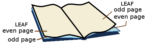 In a finished book, a page is one side of a leaf. Thus, there are always exactly twice as many pages are there are leaves. From the manufacturer's point of view, a 240-page (double-sided printing) book has 120 leaves, regardless of whether or not anything is printed on the pages, or how they are numbered.
D.1.2. Folio, Spine
Imagine a single sheet of US Letter 8.5"Wx11"H paper. It has two pages, since you can print on both sides (even if one is empty).
If you fold that sheet in half across its width, it is still one sheet. But now you have a folio, consisting of two leaves of size 5.5"Wx8.5"H. Each leaf has two pages, so you now have four pages. The fold is at the spine.
Caution: The term "folio" has several different meanings, even in the narrow field of book publishing. It may refer to folded paper, as mentioned above. Or it may refer to a particular sheet size of paper ("foolscap"). Or, it may simply refer to the number printed on a page. This last use of "folio" is discussed in the context of headers and footers.
D.1.3. Signature, Imposition
 When a book is commercially manufactured, folios are nested to form signatures. The number of folios in a signature is typically 6 to 16 (that would be 24 to 64 pages). If you were hand-making a single book at home, you might use only one folio per signature.
Now, think about how those pages must be ordered. Suppose a book contains a single signature of 4 folios. The outermost folio is printed with pages 1 and 16 on one side (before folding), and pages 2 and 15 on its other side. The next nested folio has pages 3/14 and 4/13. Nested inside is 5/12 and 6/11. Innermost is 7/10 and 8/9.
Re-arranging the page order is part of the imposition process. The process may involve tweaking the position of each page slightly, to account for offset due to paper thickness when the folios are grouped into signatures. If numerous folios are printed on a larger sheet of paper before cutting, the process may involve rotating folios so that they waste less paper.
Your home printer software can probably do imposition for a single-folio design (four pages). Anything beyond that is left to professional software. You don't need to do it. The print service does it for you, automatically.
D.2. Book Manufacture
In many cases, when you choose how your book will be manufactured, you will have at most these choices: Trim Size, interior b/w or color, paper, binding, cover finish. The novel class does not address the particular requirements of color interiors (grayscale is OK, since it is emulated by black and white). When you choose the Trim Size, other options may be limited.
D.2.1. Perfect Binding
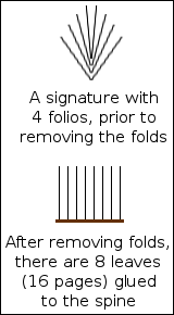 Most modern softcover books (and some inexpensive hardcovers) are manufactured using a process named Perfect Binding.
In Perfect Binding, the signatures are clamped together, and the folded area is removed by a cutting machine. Then there are no longer any folios, just individual leaves.
The leaves are glued together at the spine, possibly with reinforcement. Note that the glue is not merely at the edge of the leaves; it penetrates the paper slightly, for better strength. Finally, the cover is attached.
The Perfect Binding method is inexpensive, and is more than adequate for a book that will not receive rough handling. Whether using P.O.D. or a major mass-quantity publisher, most softcover books have been made this way for a long time. Unless you know that your book will be acquired by libraries for addition to their long-term literary collection, there is little reason to have your book manufactured by any other process. The possible exception would be books for small children, which receive rough handling under all circumstances.
D.2.2. Library Binding
Libraries rarely purchase Perfect Binding books (regardless of soft or hard cover) due to lack of durability in a library environment. The exceptions are popular books of no lasting literary value, and how-to books for evolving technologies. These may be obtained by libraries in the cheapest softcover version, because such books will be discarded long before they wear out.
Unless you are sure that your book will be acquired by numerous libraries for long-term addition to their collections, there is little reason to produce a quality hardcover version. Not all P.O.D. services offer hardcover. If you do need a hardcover version, then be sure to carefully inquire regarding its manufacture, and preferably obtain a copy of someone else's book manufactured that way.
 The best hardcovers, suitable for library use, are made using the Smyth Sewing process. A Smyth Sewn book has signatures of (typically) 12 or 16 folios. But instead of removing the creases after folding, each signature is sewn through its crease using strong thread, onto a durable spine material. The pages will remain attached, even with hard usage. If the spine material is sufficiently flexible, then the book will lie flat when opened.
Be sure to ask about spine flexibility. The most flexible methods have a soft, curved spine, and are best suited to thick novels. There is also a variety that has a square (flat) spine, which will not quite lie flat when opened. Square-spine Smyth Sewn books seem to be the fashion for documenting intellectual property.
If a major publisher is producing a book that is sure to be ordered by many libraries, due to its author's popularity or maybe a movie tie-in, then it is likely to be released as a Smyth Sewn hardcover. That's because the production method is affordable in quantity. But on a P.O.D. basis, it is a significant expense.
Different bindings must have different ISBNs, because they are different products.
If you are ordering a hardcover edition, and the supplier calls it casebound, be careful. If a hardcover book is Smyth sewn, then it is almost certain to be casebound. But not the other way around! A book can be casebound, without being Smyth sewn.
D.2.3. Other Bindings
A Perfect Bound softcover cannot be retroactively converted to Smyh Sewn. However, it is possible to convert it to a glued-on casebound. Sometimes the original paper cover will be glued onto the new hard cover. Books of this type are sometimes used as souvenirs.
If a book has very few copies, intended for permanent archiving (as with patents, and other large legal documents), then in addition to gluing, the pages may be sewn cross-wise at the spine, before attaching a hard cover. This techique is only used when the book must be tamper-resistant. It is not suited to casual reading.
D.2.4. Paper and Cover Materials
The interior paper may be white or "creme" (off-white). White paper is generally used for nonfiction, and must be used if there are interior color images (novel does not do interior color). Creme paper is generally used for fiction. The idea is that white paper creates an air of authority, whereas creme paper is more comfortable for lengthy reading. I agree. I recently read a novel that was (mis-) printed on white paper, and it was hard to read in a bright area. So, for your novel, choose creme paper.
The cover of a Perfect-Binding softcover book may be produced with a glossy or a matte finish. The fashion is to use glossy for nonfiction, matte for fiction. Again, the idea is authority versus comfort. But you may choose what you wish. "Instant Best-Seller" mass-market paperbacks often have an embossed texture, and maybe even metal foil. In the print-on-demand market, forget it. Don't even think about it.
If you do request a hardcover edition, then it may or may not have a dust jacket (costs extra). The general rule is that books for libraries have a dust jacket, which will be encased in plastic by the library. Books for documentation generally have no dust jacket, with the title and other info embossed in the cover material, for permanance. If the printer offer harcover, but does not even offer you the option of purchasing a dust jacket, then beware: Are you sure that the book is Smyth Sewn?
D.3. Interior Structure
This section discusses how a book is designed, in terms of its component pages, where they are placed, and how they are styled. The emphasis is on popular fiction. Some sections that would be required in a dissertation or other nonfiction, are much rarer in popular fiction, or are entirely missing. There is also considerable "wiggle room" in terms of structure, particularly for genres that pretend to be a truthful report of someone else's writing.
The advice you are about to receive is not authoritative. It is combined from CMoS (which focuses on nonfiction) and on actual practice, as I have seen by looking through numerous professionally-published works of popular fiction at the local public library. There is a certain amount of variation.
D.3.1. Display Pages vs. Chapter-Like Sections
D.3.1.1. Display Pages
A Display Page has its own design, and stands by itself. Examples are Half-Title, Title, Copyright, Dedication, Epigraph, Table of Contents, Map, Part Separator, and of course Blank.
Half-Title, Title, Dedication, and Part Separators are always single-page recto. A Table of Contents begins recto, but may continue verso. An Epigraph is single-page, and may be recto or verso.
Maps are one per page, and may be recto or verso. If you intend to create a large map that spreads verso-recto, be aware that the technology you will be using does not allow continuous image through the spine area. Instead, you must create two separate maps, one per page. There will be the usual inside margins.
A Blank page is almost always verso; the only exception is when multiple blanks appear at the very end of the book.
Each kind of display page has its own style, and position. What they have in common is that all of them lack a header or footer (and thus, lack a printed page number). Use \thispagestyle{empty}.
If a display page extends to a second page (such as Table of Contents), then use \thispagestyle{empty} at its begining and end, to ensure that both pages omit header and footer.
D.3.1.2. Chapter-Like Sections
A Chapter-Like Section includes things that are styled like a chapter. This includes Foreword, Preface, Introduction, Author's Note, Acknowledgements, Prologue, Chapters, Epilogue, Conclusion, Endnotes.
Almost all Chapter-Like Sections begins recto. However, chapters after Chapter One may begin recto or verso. If there is subsequent material (Epilogue, Conclusion, Endnotes, etc.) then the begin-recto rule applies.
The first page of a Chapter-Like Section section has no header, but may have a footer with page number. See the available choices for \thispagestyle.
Remaining pages in the section will have such header/footer style as pertains to ordinary chapters in the book. Exception: If a Chapter-Like Section in front matter is only two pages long, then you may optionally omit the header, or footer, on both pages. Then, use \thispagestyle at the end of the section, with choice that matches its beginning.
When a Chapter-Like Section appears in front matter, its page headers (if any) do not show the author and title of the book, the way they would appear in main matter. Instead, they show the name of the section (such as Author's Note) both verso and recto. Commands \SetVersoHeadText and \SetRectoheadText are your friends, as they permit you to dynamically change header text as you move through the book.
D.3.2. Front Matter
The \frontmatter command must be written immediately after \begin{document}. This sets page numbering to lowercase roman, and performs some other actions.
A book's front matter is about the book. It is not part of the story. The only mandatory front matter is the Title Page and its verso, the Copyright Page. On a practical basis, six pages of front matter are the minimum, and this minimum is often used, even by major publishers. See Appendix B for how to construct basic six-page front matter.
D.3.2.1. Half-Title, page i
Some book manufacturers (particulary in hardcover) place a blank or decorative flyleaf before any part of the book interior. A flyleaf (if present) is added at the bookbinding factory, and is not part of your book's interior PDF file.
Your book's first interior recto page is a Half-Title. It is a Display Page. Historically it was a protective page for the full title page, in the era when a printed interior was not immediately bound. That tradition lives on.
The Half-Title contains nothing but the book's title. No subtitle. It should be styled in the same manner as is used on the full Title Page, but typically smaller. You can place the title anywhere it looks good. It is almost never placed upper left.
D.3.2.2. Blank, page ii
Verso page ii is a Display Page. In most cases, it will be blank. This is achieved by using \cleartorecto at the end of the Half-Title page. But if you wish to manually create a blank page, verso or recto:
\clearpage\thispagestyle{empty}\null\clearpage
Instead of blank, prolific authors may show a list of their books. However, even if you wrote other books, many print services won't allow you to list them, unless the same service exclusively carries all of them.
Major publishers may provide an advertisement for the related movie. In the good old days (looong ago) an expensive book might have a high-quality illustration, known as Frontispiece. Unless you truly know what you are doing, avoid these, and just use a blank page.
At the very fancy end of book design, or often for children's picture books, the full title uses two pages, beginning here and ending on the usual title page iii. You can do that, but novel does not provide for continuing an image (or text) across the spine. Each page is independent, and there will be the usual inside margins. So, a two-page title is not recommended.
D.3.2.3. Title Page, iii
The Title Page is a recto display page. It shows the title, subtitle (if any), and author. These elements are often very decorative, and may involve imagery. They must exactly match the information you provided when you obtained the book's ISBN. Exception: Some services allow the author's name to use initials.
If there is a publisher's imprint, it goes at the base. This is achieved by using \vfill just above it.
Remember that a self-publishing service is not the publisher; you are. That's why it is called self-publishing. If you don't have anything else to put there, and don't like leaving the base of the page empty, you might use "Independently Published in Your City, YourState" or something similar.
• Note: Others have written (and I agree) that the surest sign that a book was written by an amateur, is when the Title Page simply uses the book's main text font (perhaps bold and larger). That has "term paper" written all over it. Instead, be creative.
D.3.2.4. Copyright Page, iv
The Copyright Page is a verso display page. It is primarily legalistic in nature, providing essential details about the book, as an item in commerce.
Some nations require specific information to appear on a Copyright Page. That is your responsibility to know, and is beyond the scope of this documentation.
At least in the U.S.A., the nation where the book is printed must be indicated, either on the Copyright Page or some other allowed location (such as the final verso). Many print-on-demand services use multiple printers, which may be in various nations, depending on who purchases your book. With the services I have used, this is solved by omitting "Printed in the United States of America" on the Copyright page, because it may not be true. At the printing factory, the necessary information is added by them, as a Colophon on the final verso page. This is one reason why that final verso page must be blank (in your PDF). Ask your P.O.D. service.
A Copyright Page is in ordinary text, perhaps using minimal styling such as italics or small caps. In all cases, its overall page style must differ from the page style of main text. Almost always, the content of the Copyright Page is forced downward, so that excess white space is on top, and the final line appears at the base of the textblock. This is achieved using \null\vfill at the beginning of the page.
The legalese environment prevents hyphenation, aligns paragraphs ragged-right (instead of justified), and omits paragraph indents. This style is widely used for a Copyright Page. Be sure to use \null, or a similar vertical spacing command, to separate paragraphs. If you nest the center environment within legalese, it will over-ride the ragged-right alignment.
The adjustwidth environment can be used to set the width of the lines at less than the full width. This is especially helpful if you have little to say, and choose to center the content.
Always review where lines break, if necessary inserting manual line breaks, to ensure that the meaning is sensible.
If you use them, certain words or phrases such as FIRST EDITION are traditionally set in all small caps. Use \allsmcp{FIRST EDITION}.
Numbers, such as date and ISBN, may be Old Style or Lining. The text default is probably Old Style. If you prefer Lining (looks more legalistic), then use \lnum{numbers}. Anything other than digits (and related characters) will remain unchanged by the \lnum command.
The Copyright Symbol © is pasted from a Unicode character map. Avoid using TeX code.
I have never seen a Copyright Page extend to a second page. Never. If you have that much to say, it may be that some of the information may be moved to an Author's Note or Acknowledgements section. Or, if necessary, you may use the parascale environment to slightly shrink the text and baseline skip.
If you have a Cataloging-in-Publication data block (probably you do not), then be aware that its content may be provided to you in MS Word format. Pay attention to indents, as they are part of how the data is presented. Use \forceindent or \backindent to over-ride the normal indentation (or lack thereof). Use the adjustwidth environment for block indents, but be aware that nesting one adjustwidth inside another may cause problems. It is better to end one adjustwidth before beginning a new one.
Also, CIP data uses emdash in places. MS Word may represent an emdash with two hyphens, whereas TeX uses three hyphens. Better to simply paste the emdash from a Unicode character map, which will appear the same in both MS Word and TeX.
If you need straight apostrophe or straight quotes, use \straightquote{} and \straightdblquote{} to insert a character that won't be converted to curly.
D.3.2.5. Dedication
If you use a Dedication, it is a recto display page, and must be placed immediately facing the Copyright Page.
A Dedication is not required. But sadly, nowadays many authors write a frivolous Dedication, which detracts from the book. If you feel that you need a Dedication, why not put it on your web site? Then you can always edit or remove it, if the subject of your affection runs off with someone else (or, you do). Keep it simple.
A Dedication is centered. If it is more than a few words, use the adjustwidth environment to keep it bounded, as you would for an Epigraph.
D.3.2.6. Epigraph
If you use an Epigraph, it is a display page, which may be placed verso or recto.
An Epigraph is optional. It is a short quotation, traditionally from a work by someone else. Its purpose is to set the tone of your own book, or shamelessly imply that your own talents resemble that of the person quoted. However, even though it is short, do not place copyrighted material there, unless you have the necessary legal permission. You probably don't, so forget about quoting a famous contemporary author or performer. Quotations from the Bible, Shakespeare, and Nineteenth-Century authors are popular; but even then, a more recent translation may be still under copyright.
Alternatively, you can quote from your own book, or make up something entirely new. One famous Epigraph is used in J.R.R. Tolkien's Lord of the Rings trilogy, in which each book uses the long form of the Ring's incantation as its Epigraph.
One possible use of an Epigraph is on recto page v, in books that lack a Dedication, a Table of Contents, or other important front matter beyond the Copyright Page. Alternatively, if a book has both Dedication and Table of Contents, an Epigraph may be placed on the otherwise-blank verso page vi between them. Or, an Epigraph may appear in some later convenient place in front matter.
In general, an Epigraph is set as a centered block, not occupying the full page width. The adjustwidth environment serves this purpose. You will have to manually adjust the widths at left and right, for best visual effect.
The source of the quotation should be right-justified within the block, and may be preceded by an emdash. Typically, names of people are not italicized, but titles of books are. It is not necessary to give elaborate details; this is not a bibliography.
It is not necessary to load the epigraph package. Simply construct your own style of epigraph using other methods. But if you do load epigraph: Only use \epigraph, or the epigraphs environment, within the ChapterStart environment, or on a display page. Commands \epigraphhead, \dropchapter, \undocrop do not work in novel. The \cleartoevenpage[option] command does work. Ignore the material regarding epigraphs on part pages or in bibliographies.
D.3.2.6.1. Example Epigraph: Real Quotation
This might be used for an action adventure:
\clearpage

\thispagestyle{empty}

\vspace*{10\nbs}

\begin{adjustwidth}{7em}{7em}

Cowards die many times before their deaths;\\

The valiant never taste of death but once.\par

\stake\hfill---Shakespeare\par

\end{adjustwidth}

\clearpage
D.3.2.6.2. Example Epigraph: Imaginary Quotation
This might be used for contemporary fiction with a humorous style. The fictional speaker will appear as a character in the book:
\clearpage

\thispagestyle{empty}

\vspace*{10\nbs}

\begin{adjustwidth}{7em}{7em}

Let me tell you, there's nothing more exciting than the brouhaha at Mickey's Pub each Saturday night in April.\par

\stake\hfill---Dorf McNorf\par

\end{adjustwidth}

\clearpage
D.3.2.7. Table of Contents
If you use a Table of Contents, it is a display page, beginning recto. If a second page is needed, add \thispagestyle{empty} after the table completes, but before you clear that page.
Most fiction does not have, and does not need, a Table of Contents. It is more useful when the story consists of discrete episodes with distinctive names, not just numbers. Or, if the book is a collection of short stories, a table of contents is suggested. If your book is a critical edition, or has sections by different authors, then a Table of Contents is mandatory.
 A basic Table of Contents uses the center environment, so that the Table's title and each entry appear centered on the page, without any fancy layout. The text may be italics. So simple. So effective. However, if you prefer a more formal, rectangular table, novel has its own
 toc environment.
Avoid any of the table environments that come with TeX or its packages. These do not provide the most attractive presentation for fiction, without a lot of work on your part. But if you wish the use them, do it using sandbox mode.
A Table of Contents has no header or footer, and no printed page number. Use \thispagestyle{empty}. If it continues to a second page, add \thispagestyle{empty} at the end, if you don't know where the page breaks.
Anything preceding a Table of Contents is not listed in the table. Neither is the table itself. An Epigraph is normally not listed, even if it follows the table.
You may or may not list maps or other illustrations in the table. Fiction rarely has more than a map or two, easily located in front matter by the reader, so there's no need to mention them. Use your judgement. That's different from the practice in nonfiction, especially academic works, where the illustrations convey factual data rather than artistry.
D.3.2.8. Foreword, Preface, Introduction
A Foreword, Preface, or Introduction is a Chapter-Like Section, beginning recto.
A Foreword is written by someone other than the author. It is essentially a marketing tool, by which the publisher addes credence to the work, or mere publicity, by having an expert or celebrity write something in front matter. Introductions are common in nonfiction, but extremely rare (I have never seen one) in fiction, except for critical editions of older works (where the new, original material is essentially nonfiction).
A Preface is written by the author, speaking as author, and may include a general discussion of how the author came to write the book. It may also include acknowledgements, if they are not in a separate section. A Preface is rather formal, and very rare in popular fiction. If you wish to address the reader, the less-formal Author's Note is better for your purpose.
An Introduction, when used in front matter, is written by the author. Its purpose is to provide sufficient background for understanding the material that is to follow. Thus, an Introduction is sometimes seen in the front matter of historical or technical nonfiction.
An Introduction in front matter is inappropriate for popular fiction, but I suppose it might be used for the purpose of world-building in that genre, where the main story assumes that the reader is familiar with the setting. In such a case, the setup is described by the author (as author), but not by a character in the story. Also see Author's Note.
A Foreword, Preface, or Introduction is a "chapter-like" section. That is, its style is the same as if it were a chapter, in terms of how it is titled, and the use of page header/footer. But there is a significant exception: If your book design uses header text, you do not write the author and title in headers. Instead, you use \SetVersoHeadText and \SetRectoHeadText to write Foreword, Preface, or Introduction in both. See the example Author's Note, below, for how this is done.
A Foreword or Preface is often signed at the end by its writer, with place and date. A lengthy Foreword might instead place its writer's name and credentials under the Foreword title.
D.3.2.9. Acknowledgements
If you use Acknowledgements, it begins recto. If very short, style it as a Display Page, possibly even using limited text width (as with an Epigraph, above). Otherwise, it is a Chapter-Like Section.
Most fiction doesn't need acknowledgements. Don't write Acknowledgements just because you can. Acknowledgements are for those who provided real assistance. If you want to provide a shout-out to your friends for their encouragement, consider doing it on a web page.
If you have a Preface or Author's Note, you can often include acknowledgements there (if you wish), rather than in separate Acknowledgements.
If styled like a chapter, in a book that has page headers, the verso and recto head text is set to Acknowledgements, not the author and title. Then, the opening page of Acknowledgements has no header (as with a chapter), but following pages have the header. See the Author's Note, below, for how this is done.
D.3.2.10. Author's Note
If you use an Author's Note, it begins recto. If very short, style it as a Display Page, possibly even using limited text width (as with an Epigraph, above). Otherwise, it is a Chapter-Like Section.
An Author's Note directly addresses the reader, from the author. It is often signed with name, place, and date at the end. There is no particular content. Some authors point out that a particular element of the story, which seems fictional, is actually based on a real historical event. Others babble their life stories, and how they came to write the book. Others use it as a catch-all, including acknowledgements and whatever else fits.
There is some wiggle room regarding whether the Author's note is fact or fancy. For example, in the "lost manuscript" genre, authors may (fictionally) tell how the manuscript came into their hands; but a lengthy tale of discovery is better placed in main matter, as a fictional Introduction.
If an Author's Note is two pages long, then on the second page use the same page style that you would ordinary use to start a chapter. Normally, this is \thispagestyle{footer}.
If an Author's Note is three or more pages long, then a header is permitted (if the book's main style has header). You may allow author and title to appear in header text, but it is better to indicate that this is not the main story, using \SetVersoHeadText{Author's Note} and \SetRectoHeadText{Author's Note}.
D.3.2.10.1. Example Author's Note
In a book of historical fiction, based on the author's own travels and expertise:
\cleartorecto % begins recto

\SetVersoHeadText{Author's Note}

\SetRectoHeadText{Author's Note}

\begin{ChapterStart} % because chapter-like

\null\null

\ChapterTitle{Author's Note}

\end{ChapterStart}

After many years of studying the late Roman Empire... \lipsum[1]

The Third-Century burial practices of the Alemanni... \lipsum[1-2]

I have taken great liberty with the likely behavior... \lipsum[1]

The battles with Roman forces are entirely imaginary... \lipsum[1-2]

Finally, I would like to thank... \lipsum[1]

\null

\stake\hfill \textsc{Dirk Hardcase}\par

\stake\hfill Springfield, September 22, 2016\par

\clearpage

% Be sure to re-set the verso and recto head texts!
D.2.1.11. Map
A Map is a Display Page, which may be verso or recto. You may use more than one Map, but be aware that in the printing technology available to you via novel class, a single Map cannot be continued as a spread across the spine; you must break it into two independent Maps, allowing for the inside margins.
Many works of fiction have a map or other diagram. It might be the map of a real or fictional geographic area. It might be the map of a crime scene. It might be an inheritance chart. Even though fictional, it is usually placed in front matter, presumably because a map does not actually tell any part of the story.
I have seen maps placed very early, or very late, in front matter. The general rule seems to be, "put it where it fits." However, do not place a map where some other item must be located, and do not place a map on the final verso that faces the beginning of main matter, due to its visual distraction.
A single map, or maybe two, need not be mentioned in a table of contents or illustrations. If you have a lot of them strewn around the book, then they should be listed in such a table; but this is very rare in fiction.
As with all images, a map must be placed using novel's own image placement methods.
D.3.2.11.1. Example Map
Typically, there will be nothing but the single image on a Map page, with all text self-contained. But in this example, the image only occupies part of the page. It is followed by ordinary text for the numbered locations:

\clearpage

\thispagestyle{empty}

\FloatImage{areamap.png} % b/w

\vspace{2\nbs}

\begin{center}

1. Alice Springs\\

2. Tuktoyaktuk\\

3. Pflugerville\\

4. Pucallpa\\

5. Kolwezi\\

6. Dushanbe\\

7. Mittenwald\\

8. Sanya\\

9. Ice Station 414\par

\end{center}

\clearpage
D.3.2.12. Second Half-Title
In many cases, front matter has very little content. After the Copyright Page, there is nothing else to say. But it is visually bad practice to go directly from verso Copyright Page to the start of the story on recto page 1. This can be solved by repeating the Half-Title as recto page v, with blank verso page vi. I've seen it with major writers and major publishers.
You can do the same thing with longer front matter, if it would otherwise end on a verso page.
When there is a lot of front matter (no particular amount), it is customary to use a second Half-Title to mark the boundary where front matter finally ends.
CMoS recommends that a second Half-Title be the first page of main matter. Thus, it would be page 1, with the actual story beginning on page 3. But it acknowledges that a common practice is for a second Half-Title and its verso to remain part of front matter, so that main matter begins with the story on page 1. Although I have seen a few books that follow the CMoS recommendation, it appears that the great majority of them follow the common practice.
If your book has Part Separators in main matter, then you can do without a second Half-Title.
D.3.2.13. Final Page of Front Matter
The final page of front matter is always verso. It is almost always blank. The easiest way to insert a blank page is to write \cleartorecto at the end of the preceding recto page.
Why is the final page of front matter almost always blank? It is because it faces the opening page of the main story, and you don't want to show anything that detracts from the scene or mood. But there are exceptions. For example, an Epigraph might usefully contribute to the setting. Or, in the case of an old-style English murder mystery (where you already know that the murderer did it with arsenic to inherit the family estate), a map of the estate, or a family tree, would not detract from the setting. The choice is yours.
D.3.3. Main Matter
Main matter begins with the \mainmatter command. It forces its page to recto, changes the page numbering to Arabic, and sets the count to 1.
Main matter is the story itself. In some cases, this also includes a fictional setup (Introduction or Prologue) that leads to the longer story line. It also includes material in the aftermath of the story, such as Epilogue, Conclusion, and end notes.
D.3.3.1. Half-Title in Main Matter ?
The CMoS prefers that a second Half-Title page (if used) mark the beginning of main matter. Thus, it would be page 1 (number not printed). Then, the story begins on page 3.
However, CMoS also notes that this is not the regular practice, especially with fiction. In fact, among the many popular fiction books I have inspected, when a second Half-Title is used, it is almost always the last recto page of front matter, followed by a blank verso; then main matter begins with page 1 of the story.
The choice is yours. I suggest agreeing with regular practice: If you use a second Half-Title, keep it in front matter.
D.3.3.2. Part Separator in Main Matter
If used, a Part Separator is a recto Display Page.
Some books are partitioned into distinct sub-books. A sub-book is of substantial length, not individual chapters or short stories.
If your book has distinct sub-books, then each of them has its own recto cover page, known as a Part Separator. Its verso is blank or an Epigraph. Then the accompanying story begins recto.
A Part Separator is always main matter. So, the first Part Separator is always page 1 (number not printed). Then its text begins on page 3. Do not re-initialize the page count when you get to the next Part Separator.
Part separators could be simply Part I, Part II, and so forth. They could be Book I, Book II. Or, they could have distinctive titles, such as The Northern Front and The Southern Front. If your book is "two in one" then the Part Separators would be the title (and subtitle, if any) of the individual parts. Sometimes a Part Separator has a brief description of its purpose, as in Book I. On Earth followed by Book II. On Mars.
Unless your book has a very complex structure, do not use both a second Half-Title (whether in front matter or main matter) and a Part Separator. Combine them as the recto main matter page 1: The Withens Chronicles. Part I, or simply Part I. Then the next Part Separator would be Part II.
In one book I recently noticed, there were five parts, each of which corresponded to one calendar day. The Part Separator showed the day, as in Monday, September 25. Then within each part there were several chapters, each of which took us to some different event in a different setting, all on that same day. I also note that this book had no Table of Contents; the progress of the novel was therefore a surprise, by its author's intent.
D.3.3.3. Introduction in Main Matter
An Introduction is a Chapter-Like Section. If the book is nonfiction and the Introduction is factual, it belongs in front matter, as described above. But in fiction, where an Introduction is a fictional lead-in to the larger story, it belongs in main matter.
A main matter Introduction is typically used in the "lost manuscript" genre, where some fictional adventurer or archaeologist describes how the manuscript was found and translated. Often, the narration is a moderately lengthy adventure tale, told in the first person, by some adventurer or achaeologist. Following such an Introduction, the various chapters will reveal the contents of the manuscript. If the voice of the Introduction returns at the end, it is called a Conclusion, and is in main matter.
If an Introduction is in main matter, its header text (if any) is whatever is used throughout the main story. Typically that's author verso, title recto. The reason is that such an Introduction is actually part of the overall story.
D.3.3.4. Prologue in Main Matter
A Prologue, even if one page, is a Chapter-Like Section. It belongs in main matter.
The purpose of a Prologue is to provide a quick lead-in or setting for the story, and get the reader's attention. It is confined in place and time (one scene, one perspective). The narrator may be first-person or third-person.
Do not use a Prologue for the voice of the author speaking about the book, as author; that goes in front matter, as an Author's Note.
If a book has a Prologue, then it is likely to have an Epilogue after the main story ends. An Epilogue also belongs in main matter.
I do not know of any fiction with both a fictional Introduction and a Prologue. If so, Introduction precedes Prologue.
Note: I have seen some web pages advising that a Prologue should go in front matter, and be narrated by a character who appears in the following story. Based on CMoS and actual books, I do not think that is correct.
D.3.3.5. Chapters
Finally, you have arrived at Chapter One! Not surprisingly, it is a Chapter-Like Section. Chapter One is always recto, whether or not preceded by an Introduction or Prologue.
Subsequent chapters may begin recto or verso. Or, the book may be designed so that each chapter always begins recto. In the majority of novels I have seen, recto/verso is used. The \clearpage command starts a new page (recto or verso), and the \cleartorecto command will (if necessary) insert a blank verso, so that the following material is always recto.
In the case of short stories, especially if they are by different authors, it is customary to begin each one as recto.
D.3.3.6. Epilogue, Conclusion
If your book has an Epilogue or Conclusion, it begins recto as a Chapter-Like Section in main matter.
An Epilogue is structurally like a Prologue, but tells the aftermath of the story. A Conclusion is like an Introduction, in which we step outside the main story. I am not aware of any book that has both; but if so, Epilogue precedes Conclusion.
D.3.3.7. End Notes, Appendix, etc.
If used, End Notes begin recto, as a Chapter-Like Section in main matter. The same applies to an Appendix and like material.
Page numbering continues Arabic. It may surprise you to learn that this is still main matter, but CMoS says so, and that's what was done in the few fictional books that have them, among those I have seen.
The reason is that this kind of material, which is fictional, is actually the original author's writing, entwined with the main story. It was always intended to be part of the book. Never mind that it "looks like" academic material added later.
D.3.4. At the End
The final page of your book is necessarily verso. P.O.D. printers (and many others) require that it be completely blank, because they will add some manufacturing information to that page.
So, if the text of your book finishes on a recto page, then one blank page is automatically added. However, if the text of your book finishes on a verso page, then two blank pages are automatically added.
D.3.4.1. Backmatter? Not!
Once upon a time, when printing was not so electronically automated, it was difficult to add material to the end of a previously-typeset section of front matter. So, if there was a subsequent printing of the book, with new material that ought to go in front matter, the problem was solved by placing the new material in "back matter." Then, the original pagination did not have to be altered. To stress that the added material was not part of the original, it would have non-Arabic page numbering, which might be a continuation of lowercase roman numerals from where the front matter left off, or might begin with uppercase Roman numerals.
A similar situation applied to critical editions of earlier works, which added material from different authors. The added material was never part of the original book.
That is a situation you are never likely to address. When most authors speak about "back matter," what they mean is explanatory material that follows the end of the story. That is, anything after the final Chapter, Epilogue, or Conclusion. A good example can be found in J.R.R. Tolkien's The Return of the King, which has quite a bit of material following the end of the story. That material discusses the language and history of the Elves, and a variety of other things. But its page numbering continues Arabic. It looks like critical commentary, but it is part of Tolkien's original, fictional structure for the book. Thus, it is main matter.
So, your book is unlikely to have true back matter. If you use the \backmatter command, it does nothing. If you really wish to change page numbering, then you must code it manually. This is not advised for P.O.D. books, as it may confuse someone performing quality inspection; true back matter is so rare.
D.3.4.2. About the Author
A hardcover book often has "About the Author" on the inside flap of its dust jacket. Softcover doesn't have a dust jacket, so one strategy is to add a leaf after the story finishes, and place "About the Author" on its recto. That avoids repagination of the original. It is still treated as main matter, with continued (non-printing) Arabic page number. Thus:
.. and they rode off into the sunset. % end of story

\cleartorecto

\thispagestyle{empty}

\begin{ChapterStart}

\ChapterTitle{About the Author}

\end{ChapterStart}

Dirk Hardcase is a former... etc.\par

\end{document}
• I suggest that if you wish to tell about yourself, you can put it on a web site instead, where you can easily edit or delete it.
Appendix E. Overview of fontspec Syntax
Much of what follows is a digested portion of the full fontspec package documentation. There are many more features, and ways to use them, than will be described below.
E.1. Font (Family) Name vs. Font File Name
A font file is an individual file, with its own file name, including file extension. For example, libertinusserif-regular.otf and libertinusserif-italic.otf are two different font files. This much is obvious.
A font family name, often merely called font name, refers to one or more font files that are variations of the same basic font. Some fonts are so unique that the family consists of just one file. For example, the NovelDeco font family consists of the one file NovelDeco.otf. Typically, a font family has four files, consisting of Regular, Italic, Bold, and BoldItalic variants. Even though there are four font files, there is a single font family name.
Many font families have more than four files, including Semibold and Light weights, and Condensed tracking. It is up to the font designer to decide whether a Condensed variation of the "Bubble Turble" font should be treated as a member of the "Burble Turble" family, or as a separate "Burble Turble Condensed" family.
The font (family) name can be learned by opening font files in your system font viewer. Currently, the Windows 10 font viewer uses "Font name" and the Ubuntu font viewer puts the font name in more prominent type. A font (family) name may contain more than one word, with or without spaces, and may contain a general classification such as serif, sans, or mono, because those are actually different families. But it will not contain words such as regular, medium, semibold, bold, or italic; those are for individual members of the same family. Within TeX, some of the older PostScript fonts have been re-worked as newer TrueType and Open Type fonts. The family names are slightly different, so pay attention.
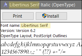
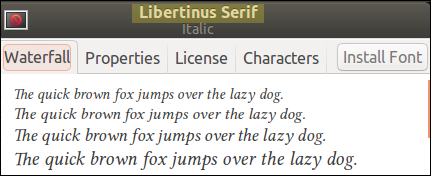
E.1.1. Set/New by Font Name vs. File Name
When you set an existing font, or create a new font command, you can use either the font (family) name, or the specific font file name. However, there may be a big difference in results!
By family name:
![]() When you use the font family name, you configure all of the Regular, Italic, Bold, and BoldItalic variants. The usual TeX commands will be applied:
When you use the font family name, you configure all of the Regular, Italic, Bold, and BoldItalic variants. The usual TeX commands will be applied:
Preamble:
\NewFontFamily\rway{Raleway}
Document Body:
{\rway I came, \textbf{I saw}, \emph{I conquered}, \textsc{I left}.}
By file name:
![]() However, if you specify a single font file name, then only that font file will be used, regardless of requests for bold or italic. Small caps will be honored, if the specific file has them:
However, if you specify a single font file name, then only that font file will be used, regardless of requests for bold or italic. Small caps will be honored, if the specific file has them:
Preamble:
\NewFontFamily\rwayi{Raleway-Regular-Italic.otf}
Document Body:
{\rwayi I came, \textbf{I saw}, \emph{I conquered}, \textsc{I left}.}
File Name Combinations:
![]() What you write is what you get. You can customize a font family by individually selecting its members. Here is the syntax. Case-sensitive, so what you see here may differ from what you have.
What you write is what you get. You can customize a font family by individually selecting its members. Here is the syntax. Case-sensitive, so what you see here may differ from what you have.
Preamble:
\NewFontFamily\frankenfont[% note the % at linebreaks

  ItalicFont=BaskervilleF-Italic.otf,%

  BoldFont=libertinusserif-semibold.otf,%

  BoldItalicFont=texgyrepagella-bolditalic.otf,%

]{Raleway-Medium.otf}
Document Body:
{\frankenfont I came, \textbf{I saw}, \emph{I conquered}, \textsc{I left}.}
Semibold, Light, etc.: The above syntax is especially useful when you wish to specify semibold (if available), rather than bold. It is also a way to select something such as light versions:
\NewFontFamily\rwlight[% note the % at linebreaks

  ItalicFont=Raleway-Light-Italic.otf,%

  BoldFont=Raleway-Medium.otf,%

  BoldItalicFont=Raleway-Medium-Italic.otf,%

]{Raleway-Light.otf}
Note that the font file in braces is the one used as the "regular" font, in this definition.
E.2. Open Type Features
Features are variations, contained within a single font file. In the bad old days, when you wanted true small caps, you had to load a separate font file that had them (and did not have ordinary lowercase letters). Now, if an Open Type font file has the smcp feature (most do), you obtain the small caps from within the same file, by asking for them. Requests for the feature may be made on-the-fly, or pre-loaded for global use.
Here are several of the most frequently-used features, relevant to fiction writing. There are many more, and most fonts have only a few of them. Even when a font has a feature, it may be limited to some portion of the characters. For example, it is common for small caps to be available only for Latin-1 letters, even though the font also contains Greek and Cyrillic. To put this another way: The availability of a feature does not tell you its breadth of coverage. Unless the font has documentation showing coverage of its features, the only way to find out is to create and print a test page.
| Description | Open Type code | fontspec code |
|---|---|---|
kerning |
kern |
Kerning=On |
common ligatures |
liga |
Ligatures=Common |
Tex ligatures |
tlig |
Ligatures=TeX |
lowercase letters to small caps |
smcp |
Letters=SmallCaps |
uppercase letters to small caps |
c2sc |
Letters=UppercaseSmallCaps |
lining numerals |
lnum |
Numbers=Lining |
oldstyle numerals |
onum |
Numbers=OldStyle |
• Kerning is the automatic adjustment of spacing between letters, so that they fit together nicely. The values are read from tables within the font.
• Common ligatures are substitutions, such as a combined ff character for two consecutive f characters. It is up to the font designer to determine which ligatures, if any, are common.
• TeX ligatures (such as replacing `` with “ and --- with —) are not actually an Open Type feature, but they are treated that way by the software. All of these are enabled by default. The fontspec manual explains how to disable them, if necessary.
• The SmallCaps feature applies only to lowercase letters; ordinary capitals remain ordinary capitals. UppercaseSmallCaps deals only with converting ordinary capitals to small caps. If you want both, use both. In most fonts that have them, small caps are slightly taller than lowercase, and slightly more widely spaced. What distinguishes real small caps from fake ones (obtained by scaling ordinary capitals) is that the weight and spacing are more compatible with surrounding text.
![]()
• Lining numerals are the ones most familiar to you, from math or accounting. They sit on the baseline and have the height of capital letters. That's just right for doing calculations, and is acceptable for things such as page numbers and chapter numbers.
• When lining numerals are mingled with flowing text, they may stand out too much. OldStyle numerals are more like flowing text: Most of the numerals are at lowercase height, with ascenders and descenders. Compare the first number as OldStyle, the second as Lining:
Most fonts use Lining numerals as their default. A few default to OldStyle numerals. Thus, you should explicitly call for the kind of numerals you wish to use.
• True OldStyle numerals have a flat top on one, and a very round zero: ![]() This may be a bit distracting. Some fonts use a transitional form, where the one has a tilted top (like big 1) and the zero is not so round:
This may be a bit distracting. Some fonts use a transitional form, where the one has a tilted top (like big 1) and the zero is not so round: ![]() Others offer you a choice, via an Open Type "style set." See the fontspec manual for how to code style sets.
Others offer you a choice, via an Open Type "style set." See the fontspec manual for how to code style sets.
• There are many more Open Type features, most of which are not useful in ordinary fiction writing. Fonts rarely have more than a few features. Some features (such as the ones shown above) have a specific meaning. Other features, such as "style sets", have whatever meaning the font designer assigns them; Thus the ss03 feature of one font may do something very different from ss03 in a different font.
E.2.1. Scale as Pseudo-Feature
Although it is not an Open Type feature, Scale=number may be written like a feature. Scale globally adjusts the size of the font, relative to what it would otherwise be. If a local font size command is also applied, then the result is the compounded value.
If the font will be mingled with other fonts in the same place, Scale can tweak a font so that it does not stand out. If Scale does not exceed 1, then the baselineskip will not be affected. Over 1 risks spreading lines to accomodate the extra size; this should not be done for fonts that will appear in the flowing main text. But over 1 is acceptable for display fonts that do not wrap lines and do not mingle with main text.
Example: Orbitron is a special-purpose font with a mechanical or futuristic look. Its characters are much larger and heavier than would be found in book fonts. If I wish to mingle Orbitron with ordinary text, I might load the font like this:
\NewFontFace\orbitron[Scale=0.6]{Orbitron} % Preamble
Then in the document body, I could use it like this:
The message was brief: {\orbitron DIE, EARTHLING.} Captain Withens smiled as he oiled his ray-gun. But ray-guns don't use oil.\par
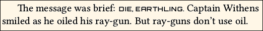
Scale is more often used for fonts that are pre-defined to have a special meaning and location, such as chapter titles or page headers. There, the font is not mingled with ordinary text, and it is OK to use a larger Scale. Then, it is not necessary to use local font scaling commands each time the font is used.
E.2.2. Color and Opacity
Even though the fontspec syntax allows you to set Color and Opacity as pseudo-features when you define a font, the novel class blocks these features. If you attempt to set them as features in a font definition, an error will result. The same applies if you attempt to add them, using \addfontfeature. However, you can still make use of grayscale using ordinary, local color commands.
You may write text in grayscale, using commands from the included xcolor package. You should only do this for text that is in special locations. For example, if you begin each chapter with a number that is very large, you might wish to make that number gray, so that it does not overpower the main text.
To avoid possible conflicts, the color specification should be chosen from a limited list of names. In order from dark to light: black, blue, violet, darkgray, purple, red, teal, olive, magenta, gray, brown, green, orange, cyan, lightgray, lime, pink, yellow, white. They will all be rendered in shades of gray (of course, black and white will be themselves). You may also choose from this more convenient list: black, gray1, gray2, gray3, gray4, gray5, gray6, gray7, gray8, gray9, white.
• Placing light text over a dark background may produce unexpected results in print, even if it looks good in PDF. If you need this effect, it is better to build the text into the background, as a single image.
E.2.3. \CreateFontFeature{code}{substitutions}
Once in a while, a font has a glyph that you would like to use, but it is not included in any of the font's Open Type feature sets. So, how to you grab that particular glyph? For example: One well-known font has a glyph named emdash.alt, which is not as long as the font's ordinary emdash glyph, and looks better in text. Unfortunately, emdash.alt is not in any of the font's style sets. Without some trickery, only a program such as InDesign can grab that glyph.
Thanks to fontspec, novel has the necessary trickery. Command \CreateFontFeature creates a fake Open Type feature code, and assigns your list of substitutions to that code. Use comma-separated entries if there are multiple substitutions. For the case in question:
\CreateFontFeature{myem}{emdash=emdash.alt}
The code myem was randomly chosen as something that is not already defined among Open Type feature codes. Once specified, the fake feature may be used in any font definition, such as this:
\SetParentFont[RawFeature=+myem]{Adobe Garamond Pro}
Of course, the fake feature has no effect if the font does not have the substitution character.
This technique may be used for more complicated features, but that is beyond the scope of this documentation. See the fontspec manual if you need to do more.
E.3. Local Modifications to Open Type Features
If you specify a particular Open Type feature, it will be generally used for that font command. So if you define a new font command with Letters=SmallCaps as a feature (and if the font actually has them), then small caps will be used for that font, whether or not you locally request them with a command such as \textsc.
Often, you can add (or sometimes remove) features on a local basis. For example, suppose that you defined the font without using its ss03 style set. You can locally add that feature to some text, using a command that looks like this:
{\addfontfeature{which feature} applied to this text}
The above code assumes that you are already using the font in that location. You cannot apply ss03 from one font to an entirely different font!
See the fontspec documentation for details of \addfontfeature.
As an alternative to changing features locally, you can define different font commands to call the same underlying font, but with different features.
Two ways to accomplish the same thing:
\NewFontFamily\baskf{BaskervilleF}

\NewFontFamily\baskftab[Numbers=Monospaced]{BaskervilleF} % tnum feature

\begin{document}

Some text {\baskftab hello 123} is here.

Some text {\baskf\addfontfeature{Numbers=Monospaced} hello 123} is here.
Appendix F. Drop Caps
A drop cap is an enlarged letter (or image) at the beginning of chapter text, with the first few lines of text wrapped around it:
Drop caps are out of fashion, largely because they do not look good when used with dialog or with short paragraphs. If you intend to use them, be prepared to write in a style where each chapter begins with a substantial paragraph. Or, consider using a specially designed first line instead.
If you use a drop cap, the first paragraph must be long enough to fill all of the shortened lines, and continue to the line beneath the drop cap letter. If instead you try to have two or more short paragraphs, then the drop cap will not work as expected. To solve this problem, you can break using \\ to fake a paragraph ending, then use \forceindent to fake a new paragraph indent.
F.1. Built-In Method vs. Lettrine
A. In novel, the built-in \dropcap command is preferred to any other method for creating a drop cap. See the next section for its usage.
B. Alternatively, you may load the lettrine package, and use it as described in its own documentation. If lettrine is detected, novel will configure it so that lines remain on grid, and are not pushed down.
C. You may use both \dropcap and \lettrine in the same document, as they are independent, and use different settings.
D. In novel, the \lettrine command does not accept an image. Use \dropcap.
E. Only lettrine offers the rarely-used slope feature.
F. Both \dropcap and \lettrine are incompatible with \FirstLine. If you need to set the entire first line in small caps, you are more likely to be successful using \dropcap as described below.
F.2. \dropcap[options]{letter or image}
A. The \dropcap command is based on lettrine technology, but has different options and behavior.
B. The \dropcap command accepts the following options as comma-separated key values:
lines=integer Number of lines indented by the drop cap. Default 3.
gap=length Distance from drop cap to indented text. Default 0.25em. (note 1)
hoffset=length Moves drop cap horizontally. Default 0em.
voffset=length Moves drop cap vertically. Default 0em.
ante={text} Precedes drop cap with normal text. Default empty. (notes 2,4)
ante*={text} Like ante={text} but auto-hangs text in left margin. (notes 3,4)
scale=number Scales drop cap letter (not image). Default 1.
bloat=number Horizontally scales drop cap letter (not image). Default 1. (note5)
depth=integer Adds blank line(s) beneath drop cap baseline. Default 0. (note 6)
 • Note 1: The
 gap is equivalent to lettrine's findent. There is no equivalent to nindent or slope. If you wish to move the first line of text closer to the drop cap, use \kern or \hspace there.
• Note 2: ante is typically used for placing quotation mark before the drop cap. But the authoritative CMoS recommends that such an opening mark be omitted, at least in American style. If the mark is placed, it is at normal text font, size, and position (this is the style used).
 • Note 3:
 ante begins at the margin, and thus pushes the drop cap to the right. With ante* its text hangs in the left margin, so that the drop cap is aligned with the margin. This is visually better, providing that you have enough margin to accomodate the ante text. Setting an unsafe zone may be helpful. See the main documentation.
Example at right: \dropcap[ante*=``]{O}
• Note 4: You may use \charscale to manipulate the size and position of ante text. No other styling (such as font or color) may be applied. The ante text will always be black, in the main font. This is standard.
 • Note 5:
 bloat multiplies scale horizontally. The primary use of bloat is to tweak where the lines break, by making the drop cap slightly narrower or thicker.
Example at right: \dropcap[scale=1.2,bloat=0.75]{O}. The effective vertical scale is 1.2, and the effective horizontal scale is 1.2x0.75=0.8.
• Note 6: If the drop cap character has a prominent descender, then you may need to create room underneath it using depth, or the descender will intrude into the text beneath it. This can only be decided on a per-character basis, depending on the font.
 C. If the content of the drop cap ends with png, PNG, jpg, JPG, jpeg, or JPEG, it will be interpreted as an image. It will be aligned so that its bottom is at the lowest indented baseline. You may position the image using the
 hoffset and voffset option keys. The image cannot be scaled by hscale or vscale, because it must be at exact size and resolution. Thus, whether or not the image's top aligns in the desired location, depends on how you created the image.
Example at right: \dropcap[voffset=-0.15em]{I-shade.png}.
D. If lines=1, then \dropcap has no effect. This applies whether or not the command or ante is starred. That is, the following lines of code have the same result:
“It was dark and stormy,” he said.
\dropcap[any keys,lines=1,ante*=“]{I}t was dark and stormy,” he said.
E. When the drop cap is a letter (not image) without scale, or with scale=1, its top will lie at the capital X-height of main text. This is the most commonly-used style. If the letter has upper diacritical mark, then the mark will be set higher.
F.3. \dropcap*[options]{letter} starred version
A.  In its starred form,
 \dropcap* will place a rectangular box around the drop cap letter (but not image).
B. If the letter is in the Latin-1 or Latin Extended A character sets, then the box will ignore any upper diacritical mark, so that the mark sits above the box.
C. The boxed letter is a convenient reference frame, in case you wish to create an image of the letter in a graphics program. If you do that, then you will probably need to apply some negative voffset to the image. You may also wish to kern the first line closer to the image.
D. Example: At right, the top section shows a drop cap I with box. This portion of the PDF was imported to a graphics program, and the boxed area was used as template for the image shown in the lower section. Then the image was substituted for the original boxed letter.
F.4. Drop Cap Font and Color
A. These settings apply to \dropcap, but not \lettrine.
B. The default drop cap font is NovelDeco.otf with its Open Type feature dcap. These glyphs are modeled after the Libertinus Serif Display font, and are specially designed to look good at the enlarged size of drop caps, as well as align with the left margin. Also, characters with prominent descenders (such as Ccedilla) are designed so that the descender, rather than the base letter, sits at the baseline. This avoids the need for depth setting.
C. To change the font used by \dropcap, you must first define one or more font commands in Preamble. For example:
\NewFontFace\mynicedc[features]{font file name}
Then, you set the font. This may be changed anywhere:
\SetDropCapFont{\mynicedc}
D. Do not use Type1 or Metafont fonts. If the desired font is only available in one of those formats, you can use a font editor such as FontForge to convert it to Open Type or TrueType format. Then, as described above, load the converted file by its exact file name. If the font has mssing extrema, that is almost never a problem. Overlapped hints are rarely a problem. But self-intersecting glyphs and open paths may be a problem, if you use those glyphs.
E. Default drop cap color is black. To change it, use xcolor syntax. Either of these:
\SetDropCapColor[color model]{color value}
\SetDropCapColor{color name}
Only grayscale may be used.
F.5. Drop Cap With First Line Small Caps
A. The \FirstLine command does not play well with either \dropcap or \lettrine. This is not a trivial fix.
B. If you require a drop cap to be followed by an entire first line in small caps, Then you must manually code it. You will probably get better results using \dropcap instead of \lettrine.
C. Use \dropcap{letter or image}\textsc{some text} rest of paragraph.
D. Guess at how much {some text} needs to be. Compile, look at result, then adjust and try again.
E. It is possible (although unsightly) to end {some text} at a hyphenation point in its final word.
F. Again: There is no known better way to do this.
Appendix Y. Licensing and Credits
A. Licensing: The novel document class, including software, examples, documentation and supporting images, is distributed under the terms of the LaTeX Project Public License, version 1.3c only. Exception: The included font NovelDeco.otf is distributed under terms of the SIL Open Font License, v.1.1.
To ensure that your book may be sold commercially, be careful to use only fonts that allow commercial usage. That may exclude some of the fonts in the LaTeX font catalog. See Appendix C.
B. Credits: Within the TeX code files, you will find places where small or large pieces of code are the work of someone else. Names or organizations are credited in-place within the TeX code, according to license.
Various clipart graphics were obtained from openclipart.org.
Font NovelDeco.otf was created using FontForge. The font is partly derived from Libertinus Serif, which in turn is derived from Linux Libertine O.
In places, I offer opinions or make suggestions regarding design. These are largely based on my own inspection of popular fiction books, at my local public library. In some cases, I follow the Chicago Manual of Style (CMoS), hardcover 16th edition. However, please do not regard my opinions and suggestions as authoritative.
Appendix Z. Changes in v.2.1.
Important Changes
Version 2.1-2.2 (2024) Added choice babel/polyglossia. Revised uuid.
Version 1.86 (2024) docs edited.
Version 1.84 (2023) docs edited. Probably final update.
Version 1.83 (2023) corrected minor typo. Will not affect most users.
Version 1.82 (2023) adds a user setting, to change the default indent.
Version 1.80 (2023) tweaks some internal code, for faster compiling.
No new features or bugs. If you have a document built with the earlier
version 1.52, use class option revert to avoid using the tweaks.
In any case, if you are re-building an earlier document, pay careful attention
to line breaks and pagination. Due to various adjustments in component
packages and fonts, a document built in the past may look slightly different
if re-built now.